Self-Checkout Loss: Three Ways to Rethink SCO Design
Full Report - Key Insights, Three Ways to Rethink SCO Design and 20 Design Concepts
Table of Contents:
- Foreword
- Executive Summary
- Research Objectives & Design Brief
- Methods and Tools
- 11 Key Insights
- - 1 – Frustration - Bad Experience
- - 2 – Frustration - Hard to Use SCO
- - 3 – Scanning Issues - Hard to Use
- - 4 – Scanning Issues - Slow Host Response
- - 5 – Scanning Issues - Bad Layout
- - 6 – Payment Verification - Contactless
- - 7 – Payment Verification - Cash Vs Card
- - 8 – Communication - Host & Shopper Breakdown
- - 9 - Communication Issues - Poor Feedback Loop
- - 10 – Communication - Untidy Spaces
- - 11 – Personas
- Three Ways to Rethink SCO Design
- - 1) Adopt a Systematic Approach to Self-Checkout Design
- - 2) Consult Crime Prevention Thinking
- - 3) Give Designers a Seat at the Table
- 20 Design Concepts
- - Improve Participation
- - Improve Scan Accuracy
- - Reduce Walkaways
- Conclusions
- Recommended Actions
- Work with Designers?
- Appendices
- - A.1 - Shopper and Staff Personas
- - A.2 - Crime Science Review
- - A.3 - Crime Science Frameworks
- - A.4 - Evaluation of Designs: General Considerations
- - A.5 - Crime Prevention Process: Overview of Process Models
- - A.6 - Design Frameworks in Context Overview of Security & Crime Prevention Frameworks
- - A.7 - Combining Design & Crime Thinking
Languages :
In this unique applied research study, academics and designers partnered with four of ECR’s Retailer members to immerse themselves in the self-checkout experience, understanding from the perspectives of the shopper and self-checkout supervisors, their journey from entry to exit, and their design challenges and frustrations. Whilst some Retailers have taken strong design approaches, the design-research nevertheless found SCO machines ‘plonked’ wherever they can reasonably fit, and shoppers not always sure how to use the machines or smoothly navigate the SCO environment. In response to this problem context, the design researchers adopted a human-centred design-led approach and formulated key insights to reframe the challenges at self-checkout. Then generated a range of concepts, most of which amount to sketches of possible incremental design changes that might help reduce retail losses and improve customer and staff experiences.
Research findings overall suggest that there are no silver bullet design solutions for the complex challenges faced at SCO and instead an ecosystem of low-tech and high-tech design solutions will have a role to play in reducing customer frustrations and improving flow at self-checkout. While improved machine solutions (including future capacity for AI computer vision technology) can address some existing challenges, the key takeaway from this report is to show how refreshed “design thinking” approaches and small design interventions can make a big difference. The report highlights simple design methods that can be adopted and low-tech concepts that can be adapted and tested by Retail partners to improve upon a range of local problems, suggesting improvements that take a human-centred focus. It urges Retailers to engage with design thinking and offers a detailed explanation of concepts from crime prevention to better understand design context at SCO to help improve customer experience and reduce retail losses.
Foreword
The ECR Retail Loss Group is delighted to have had the opportunity to work with the University of the Arts London, Design Against Crime Research Centre under the leadership of Professor Lorraine Gamman in support of this innovative study on the potential role of new design thinking in managing the use, misuse and abuse of self-checkouts.
As our previous studies have highlighted, self-checkouts present retail stores with opportunities, problems and challenges.
In this unique study, academics and designers partnered with four of our retailer members to immerse themselves in the self-checkout experience, understanding from the perspectives of the shopper and self checkout supervisors, their journey from entry to exit, and the design challenges and frustrations.
Two reports have been generated for this project: this ‘full’ report contains research insights, twenty design concepts, and includes a comprehensive account of DAC’s design-led approach, methodology and crime science thinking. The second ‘short’ report covers the research insights and the design concepts. We encourage you to review these in your business, with as many functions as possible, including those on the shop floor and in the critical role of the self-checkout supervisor.
Most of all, we encourage you to consider the three recommendations from the researchers. First, given the design issues the researchers uncovered, organisations should consider a survey of self-checkout hosts, to listen to their ideas on what is working and what is not working at the self-checkouts. Secondly, organisations could encourage their top managers from across the different functions, to immerse themselves in the self-checkout experience and journey, mapping the journey of the shopper, documenting the failure points and to co-create new design approaches to improve participation, the customer experience and increase accuracy. Finally, the researchers recommended that retailer organisations consider adding a seat at the table for a designer, to help oversee the expansion of self-checkouts.
Above all, I very much hope you enjoy reading this report and utilising its findings to better understand how design might be impacting upon your objectives to improve the shopping experience through self checkouts while minimising loss.
Finally, I would like to thank all those companies that agreed to support this study – your contribution to helping the broader retail community better understand this important issue is very much appreciated.
John Fonteijn
Chair of the ECR Retail Loss Group
Executive Summary
Design Thinking for Retail
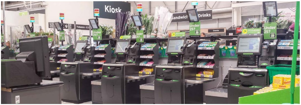
This study seeks to promote a positive customer experience at SCO as well as the reduction of retail losses through better use of design and “design thinking”1. As part of a short design sprint, our design team visited multiple retail locations, observed shoppers and shadowed SCO hosts in different stores. Taking a human-centred design-led approach, we formulated insights from the research, reframed the challenges at SCO and responded with a range of concepts most of which amount to incremental design changes that might help reduce retail losses and improve customer and staff experiences. Whilst some Retailers have implemented design processes, we nevertheless found SCO machines ‘plonked’ wherever they can reasonably fit, and shoppers not always sure how to use the machines or smoothly navigate the SCO environment. This is part of problem landscape where small design interventions can make a big difference, and refreshed design approaches can help.
This report synthesizes our research findings and design thinking in response to insights gathered from Retailers, hosts and shoppers. It suggests that improved machine solutions (including capacity for AI computer vision) can play a role but are not the singular remedy for complex challenges. Astute assessment of layout, signage and digital communication design at existing SCO machines as well as listening to staff about insufficient and/or clumsy store responses to customer problems, may help better understand the real barriers to success. Also, what to improve, by design.
Our findings about what sort of design adjustments could be made in SCO scenarios are presented in two reports: a ‘short report’ containing just the research insights and design concepts, and this full report, which can also be found online2, containing the aforementioned content in addition to a comprehensive account of DAC’s design-led approach, methodology and crime science thinking by criminologist Prof. Paul Ekblom (for those who wish to apply design against crime ideas in practice).
Both reports seek to highlight simple methods and low-tech ideas that can be adopted to improve upon a range of local problems, suggesting improvements that take a human-centred focus and ask Retailers to engage with design thinking to better understand design context.
We recognise some Retailers already employ design teams and are very familiar with design thinking. Also, that your organisations have invested heavily in top-down design refurbishment and rebranding of self checkout. What this report advocates is how to refresh bottom-up design understandings that your staff and customers know are needed on the shop floor. Paying constant attention to self-checkout environments and regularly making design tweaks rather than waiting for new machines or a massive design overhaul is what we see is possible. To repeat, small incremental design changes at SCO, even retrofits, can make a difference and a strong contribution to staff, customers and your business.
Given there is no one design layout or SCO machine that will work as a fail-safe prescription for all stores, we offer not just design responses but an account of our design process, which incorporates human centred and service design methodologies to help you create useful design responses to address your specific needs.
Design Responses
Below are just two examples (see further designs and more detail on pages 10-21) of design responses to SCO challenges our team generated for the stores they visited which we hope will inspire you to read further:
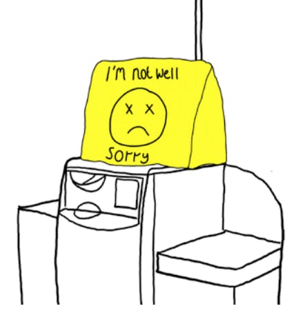
Ill Till Cover
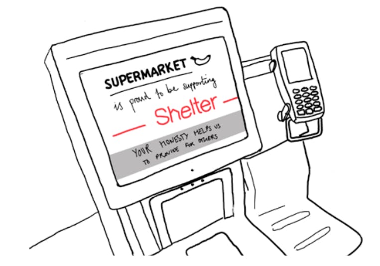
A playful material cover to clearly indicate when an SCO till is out of order. By using a larger, visual cue, shoppers can see which tills are out of order from a distance, rather than waiting until they approach the screen. This can be indicated in various ways, and can adapt store design colours, but we recommend using physical objects as opposed to digital signage which can often produce visual clutter this is easily ignored by shoppers.
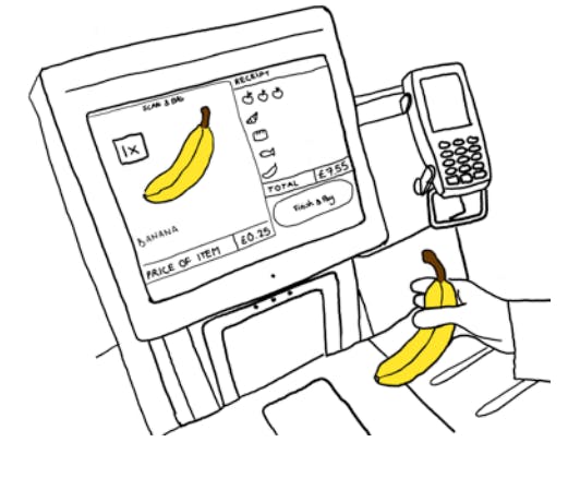
Using Icons
Using large visual icons, instead of words, to improve the customer interface for users as well as hosts, who can now see the screens from farther away, can improve SCO. By showing each item scanned, staff can check whether mis-scans have occurred by matching the icon on screen to the scanned item. Shoppers will be able to check that they have scanned and bagged the correct item while deterring theft through publicising the item being scanned. There may be scope for linking this data with camera-based product detection technology.
The “Design Thinking” that generated the above design solutions to problems encountered at SCO has a role to play as some Retailers already know, but there is room for more, and now is a good time to invest in these practices. Design thinking can be introduced to your organization by employing design experts on short sprints, or even design graduates as residents regularly working on the shop floor to help you engage with your staff to figure out changes appropriate for your context. Our easy to try methods documented in this report can also help you understand why design can respond appropriately to almost all local challenges, in effect helping you ‘control the SCO environment dynamically’ (Beck, 2018)3. Underlying issues may be linked to ‘design fatigue’, a term used colloquially by DAC but has also been expressed in different terms by Beck.
‘Design fatigue’ is the all too frequent moment when customers become so annoyed with automated service, they simply choose to act in defiance of store by petty theft and/or walking out of the store (in the worst cases walking away with unpaid goods or insulting staff). Hurried confused and frustrated customers sometimes justify obtaining goods without (sufficient) payment whether accidentally or intentionally. At the other extreme are what Emmeline Taylor (2016) calls ‘SWIPERS’4: those ‘seemingly well-intentioned patrons engaging in routine shoplifting’. Design adjustments can quickly make things easier to reduce customer frustrations and find canny ways to deter scheming thieves, that are part of but not exclusive to the following description of categories such as:
Non-scanning: sometimes referred to as Scan Avoidance, this can be carried out in several ways at Fixed SCO machines:
- Passing items across the scan area ensuring the barcode cannot be read.
- Passing items around a scan area.
- Stacking items to obscure barcodes.
- Leaving items in a basket or trolley
Mis-scanning: there are a number of ways that mis-scanning occurs, most are in the favour of the shopper, however double scanning can benefit the retailer if not detected. The list below captures five forms of mis scanning at Fixed SCO:
- Product Switching: this is occurs through product misrepresentation, where a user places a particular item on a weigh scale, such as a kilo of grapes or a bottle of wine, and then chooses a cheaper item from a list of options available, such as carrots or potatoes.
- Barcode Switching: this occurs where a user obtains a different (usually cheaper priced) barcode and scans it as a more expensive product is moved across a Fixed SCO scan area. Alternatively, a user can utilise a cheaper barcode on another product to scan an item, particularly where they look and/or weigh the same, such as bottles of wine.
- Multi-variety Errors: this occurs where a user has selected a product which is available in a number of varieties or flavours, such as a tins of cat food – chicken, beef, fish etc. The consumer simply scans the same variety several times to speed up the process and then places all the items in the bagging area. While there is generally no immediate financial loss for the retailer, the inventory system will now incorrectly assume it has sold more/less of any given SKU.
- Promotion Errors: this relates to programmes such as Buy One Get One Free (BOGOF) where the user scans only one item (assuming the ‘free’ item does not need to be scanned). While there is generally no immediate financial loss for the retailer, the inventory system will now incorrectly assume it has sold less of any given SKU.
- Double Scanning: this occurs when a consumer accidentally scans and then subsequently pays for the same item more than once. This can lead to overpayment by the consumer and the corruption of store inventory records.
Walk-away's: this form of loss occurs at Fixed SCO machines when a user has scanned some or all of their items correctly and triggers the completion of transaction process but does not make payment, simply walking away with the items. A variant of this form of loss is where the user scans all their items and triggers payment by card but does not enter the card correctly in the card reader and/or enters the wrong pin number. For some systems this will generate a payment error/declined print-out which, to the casual observer, may be misconstrued as a valid receipt. They then walk away leaving the transaction uncompleted.
Recommendations
Whilst there are no silver bullet design solutions for addressing SCO losses and mitigating friction in the retail environment, there is much that store staff and design professionals can do to make a difference. Our design responses and recommendations (pages 20-28) will not offer solutions for every store nor will they remedy all possible SCO challenges, but they can work alongside other advancements like AI computer vision and vision-based security at SCO. We hope that our design-led approach and methods of how we generated potential remedies will be of value to all organisations. Our view is those stores already preparing for more widespread introduction of SCO machines, or mobile self-scanning technologies, should understand context to better manage design of visual communication, layout and flow in pragmatic and consistent ways. This is why we urge readers of our report/s to learn some simple lessons and use our methodologies in order to fully comprehend what is meant by a design-led approach.
We hope that what follows will help broaden your understanding about how to better use design for SCO, to absorb staff know-how and meet the needs of your customers in user-friendly ways. Also, to thwart evolving forms of theft with agile physical and digital design responses that can work to design out crime in ever-changing times.
Introduction
Research Objectives & Design Brief
Research Objectives
The objectives of the research were to understand how we might:
- Improve SCO Participation – Encourage more customers to use SCO.
- Improve Customer Experience – Reduce friction, frustrations and walkaways.
- Improve Scan Accuracy – Reduce mis-scan, non-scans and other forms of misuse and abuse that contribute to retail loss.
The design team approached these challenges through immersive research in the supermarkets with the help and facilitation of our Retailer partners. Our research uncovered insights which led to design concepts that we present pragmatically in this report. Above all, our aim is to help Retailers adopt a human-centered approach and easy-to-use design methodology when investigating future challenges, so as to better develop and implement new design proposals.
Design Brief
SCO is here to stay and likely to expand across stores globally. ECR asked the Design Against Crime Research Centre how we might better listen to store staff and customers to find out what problems and frustrations exist at SCO, and whether or not design could help resolve some of these problems. More to the point, how might we use cost-effective design communication, store and SCO layout, as well as service design to improve customer experience at self-checkout? What could we do to ensure that different stores could utilize our ideas and adapt designs for their own unique problem contexts? Apparent customer confusion at machines often appears to correlate with misuse and abuse (theft). Could we design out some crime opportunities and customer frustrations ensuring positive customer experience is not compromised by overdetermined security?
Design Methodology
The Double Diamond Framework
On this project, four retailers allowed DAC researchers the opportunity to shadow and interview their staff whilst observing customers and other interactions and create case studies. Following this research and a subsequent period of design development, we were able to present our findings at the ECR Self-Checkout Innovation Conference. Experts representing the loss prevention, customer service and technology functions from 30-plus Retailers provided feedback on the design concepts, and their insights contribute to the newest iterations of design concepts provided in this report.
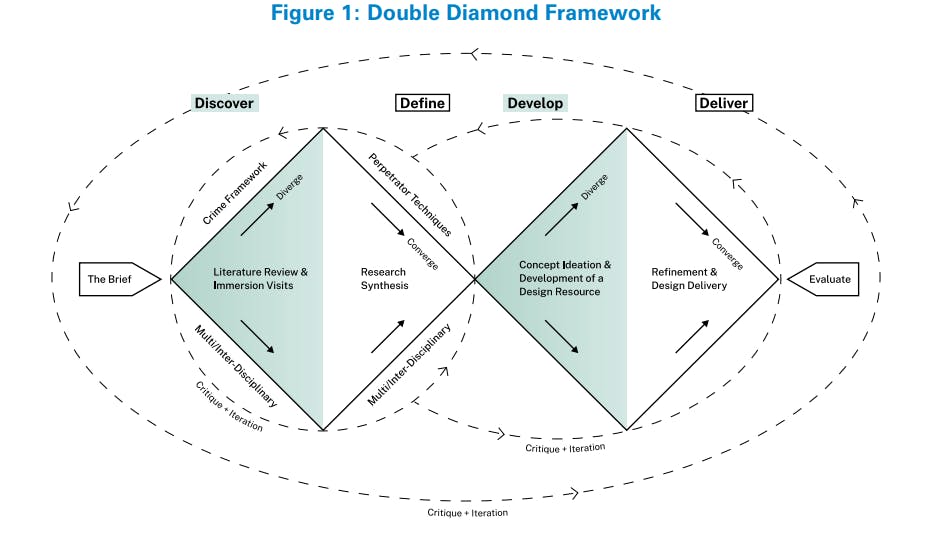
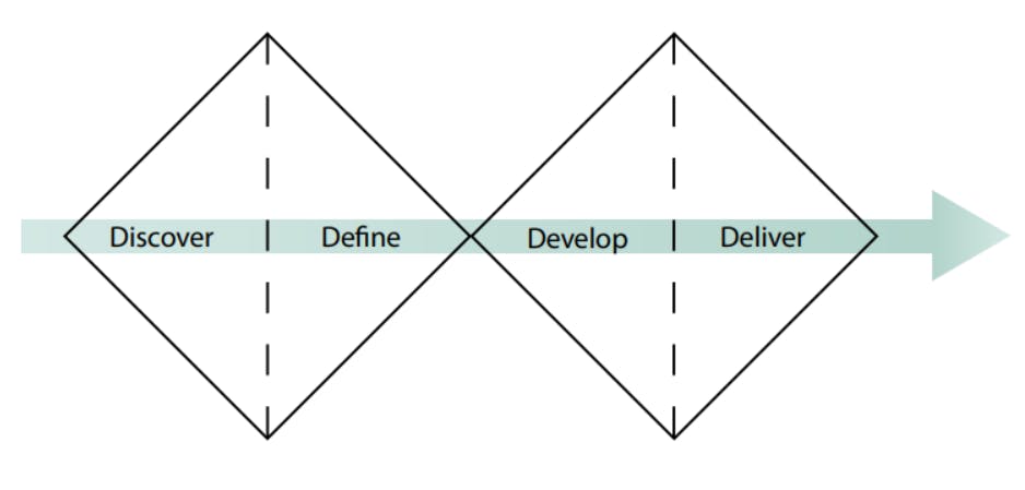
Design Against Crime’s (DAC) design process is visualised in the Double Diamond1 framework (Figure 1), an iterative 4 stage process that cycles through phases of exploration and synthesis.
Stage 1. Discover: Research to uncover insights and expand contextual knowledge. In this stage the designers immersed themselves in the retail environment, interviewing and shadowing retailers in order to identify existing and state-of-the-art SCO products, services and layouts, to identify points of friction in the SCO experience for hosts and shoppers, and to understand latent needs and desires of hosts and shoppers.
Stage 2. Define: Synthesise the research findings into frameworks that elucidate the key challenges and make it easier to identify opportunities for design interventions.
Stage 3. Develop: Come up with any number of potential design responses to the challenges identified.
Stage 4. Deliver: Refine the design responses and recommendations into a range of workable solutions that contribute to a design resource of appropriate responses.
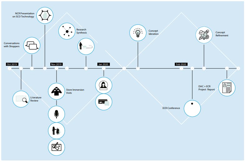
Timeline of Activities
This visualisation provides a general overview of the 22-week project timeline and the design research activities conducted by DAC in relation to the Double Diamond framework.
Methods and Tools
Overview of Design Research Activities
On the retailer immersion visits, we used a number of design research methods and tools to build an understanding of self-checkout challenges. Also to understand human factors across diverse store contexts. Different design research methods were used to gather different kinds of information. The design team often adapt such methods and tools to make them useful in different challenge contexts.
Interviews with self-checkout hosts, retail staff members, and a range of shoppers, help us to understand first-hand experiences and opinions. Hosts and staff are experts on the retail environment and learning from their experiential knowledge helps identify challenges and issues that otherwise might not be identified if left to observation alone. Shoppers are the other half of the self-checkout equation, and their experiences and opinions shape our understanding of what works well at SCO, what causes friction, and potentially uncover what leads customers to abuse the system.
Observation informs our understanding of latent desires and needs of shoppers and hosts. By looking and listening unobtrusively, we can get an unfiltered look at people’s natural behaviours. Also to witness firsthand small details that people might not be aware of or might not recall in conversation.
Shadowing and guided tours support our understanding of how hosts and shoppers navigate the selfcheckout space. This provides us with the critical opportunity to learn about processes and activities in context, gaining an understanding of how hosts and shoppers handle unique situations.
User-centred research tools aim to uncover host insights through a variety of methods and techniques that help visualise problems and potential solutions. We apply design-led research approaches and devise research tools specific to the problem context.
ECR Conference (Feb 2020) with 60+ Retailers from Europe and the USA took place in London where there was an open discussion and critique of the design team’s SCO design concepts and recommendations. The design concepts in this report reflect the Retailers’ feedback.
11 Key Insights
Noticing Patterns and Developing Key Findings
Immersive store visits with the participating retailers, provided the design team with a wealth of information. Data collected included observations, quotes from interviewees, artefacts from collaborative sessions, pictures and audio recordings. In order to use this data in a meaningful and systematic way, we developed key insights from clusters of observations. Key insights help to communicate the most important findings from the research. These insights are not simply one-off observations; rather, they are formed from a series of such observations and represent many people’s needs and desires. These insights become the basis for ideation: helping to develop ideas, concepts and prototypes that are based on real data.
Key Insights
Frustrations
- Disorderly queues, congestion in the SCO area and friction at self-checkout contribute to an unpleasant and chaotic experience for hosts and shoppers. These frustrations affect customers’ actions when they use SCO, manifesting in mistreatment of staff and other shoppers, and contributing to mis-scans, non-scans and walkaways.
- Inconvenient and inefficient SCO procedures annoy shoppers and are used as justification to act in ways that contribute to retail losses.
Scanning Issues
- Hosts and shoppers have issues with the usability and legibility of SCO interfaces.
- Hosts find it difficult to manage their SCO area and provide customer service and surveillance when there is extensive multitasking and incorrect staff to SCO ratios especially for long periods of time.
- SCO layout greatly affects hosts’ ability to manage the checkout area.
Payment Verification
- It’s not obvious to shoppers or hosts when the contactless transaction is complete.
- Shoppers frequently struggle to navigate to the correct till for their desired payment type, notice signage and comprehend written information around them.
Communication
- There are frequent breakdowns in communication between shoppers and hosts.
- Systems in place for hosts to report to management are slow and not easy to use. This creates apathy and fatigue towards these procedures.
- Daily issues encourage ad-hoc solutions such as bespoke signage, however it often results in obtrusive designs which highlight lack of consideration and consistency of design language.
Personas
- Diverse shoppers have diverse needs, which must be acknowledged and addressed across the SCO process.
11 Key Insights: Frustrations
The following insights deal with the notion of frustration – amongst both shoppers and hosts – illustrating how emotions can overwhelm, and how annoyance and confusion contribute to loss and negative experiences at SCO.
1 – Frustration - Bad Experience
Disorderly queues, congested SCO areas and other unpleasant and chaotic experiences affect hosts and shoppers. For customers, it can manifest in mistreatment of staff and other shoppers, and contribute to mis-scans, non-scans and walkaways.
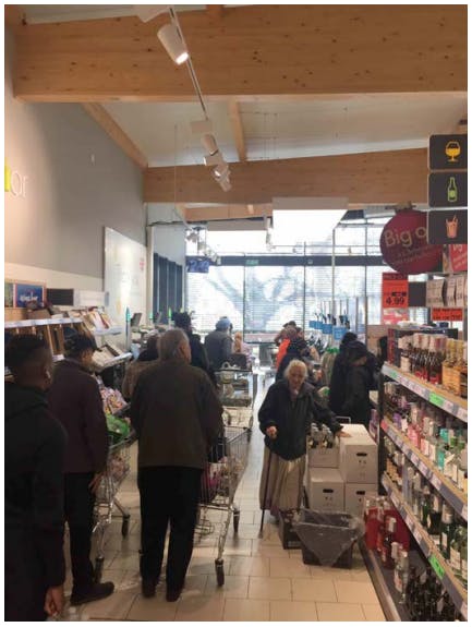
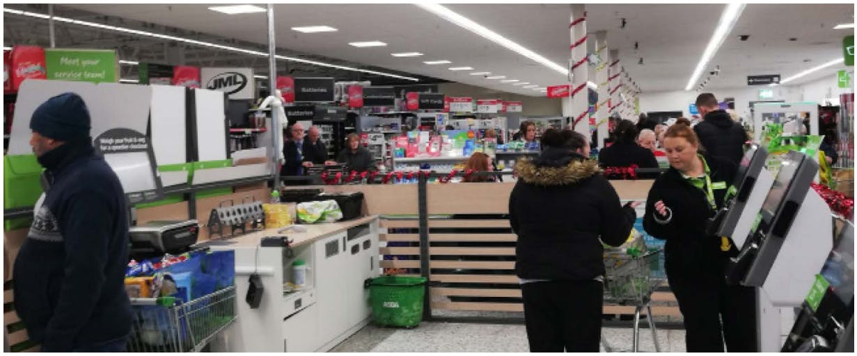
Overcrowding creates blind spots for hosts in the self-checkout space. Congestion may occur as a result of broken-down tills creating longer queues; trolleys being mis-directed into the SCO area; self scan shoppers who have many items overwhelming SCO tills, or inadequate barriers delineating where queues should line up, to name a few.
Evidence
Many shoppers go directly to the first till, then notice it is out of order. By the time they notice this, the next shopper in line is already at the next free till, so they end up awkwardly standing in the middle of the SCO area, perplexed.
Observed at multiple retail locations.
At one store, the queue expands into two lines, for cash and card. At the start of the queue, there is no indication this will happen. However, shoppers who know this will cut through the queue, making other shoppers angry.
Observed in store.
After wait times surpassed estimated wait minutes posted at the start of the queue, one shopper began to read a magazine while they waited, another shopper swore to voice their frustration.
Observed in store.
The queue pushes into the SCO area, because there is no barrier at the front of the queue. This creates congestion and disorder and causes problems for the hosts.
Observed at multiple retail locations.
2 – Frustration - Hard to Use SCO
Inconvenient and inefficient SCO procedures annoy shoppers and are used as justification to act in ways that contribute to retail losses.
Customers will use SCO for its perceived speed and efficiency. To avoid inefficiencies that might require assistance or will cause a delay, shoppers might knowingly act in ways that, for all intents and purposes, constitute theft. For example, selecting a random bakery product at checkout if they can’t recall the exact name of their bread. Shoppers will justify these offences by reasoning that the possible price discrepancy is not significant, or that the SCO system is needlessly difficult.
Evidence
There have been difficulties with students who only have cash using the wrong lane and being redirected. This can be a reason for stealing or even used as an excuse to justify stealing.
Interview with staff.
“I guess sometimes I do end up accidentally ‘stealing’. I often won’t know what type of loose apple I have for instance. I’m not going to go back and check, so I’ll just pick the cheapest one.”
Interview with a shopper.
“It happens a lot (accidentally not paying for something). Sometimes you have to keep everything on that small SCO desk thing, and sometimes you just don’t see something, like a chocolate bar. It’s never massive, but little items are easy to forget about.”
Interview with a shopper.
The SCO area is shared with Scan & Go. Shoppers using SCO are not usually allowed more than 15 items, but shoppers using Scan & Go can fill up their cart with many items, and use the same till, causing congestion.
Observed in store.
11 Key Insights: Scanning Issues
The following insights are built around issues with scanning at self-checkout. These insights illustrate common problems encountered by hosts and shoppers, which prohibit effective scanning at selfcheckout, thereby contributing to loss and tension.
3 – Scanning Issues - Hard to Use
Hosts and shoppers have issues with the usability and legibility of SCO interfaces.
Shoppers note frequent hesitations and issues with the self-checkout interface, with certain demographics often requiring much more help than others. In addition, hosts struggle to view the screens from afar and report usability issues with lighting systems. The SCO interface needs to be adapted to support use by all demographics, and for both shoppers and hosts as key users.
Evidence
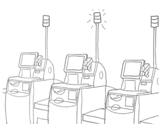
“When the light above the scan is red, then they think the till is closed, and hosts are asked if it’s open. The light system is too ambiguous. Customers don’t know what each colour means.”
Interview with staff.
During an interview, we learn that, in order for a host to confirm that the avocado a shopper is swiping is, in fact, tagged as an avocado, the host must read the list on the shopper’s screen which can be difficult when further away.
Interview with staff.
During an interview, we learn that, in order for a host to confirm that the avocado a shopper is swiping is, in fact, tagged as an avocado, the host must read the list on the shopper’s screen which can be difficult when further away.
Interview with staff.
4 – Scanning Issues - Slow Host Response
Hosts find it difficult to manage their SCO area and provide customer service and surveillance when there is extensive multitasking and incorrect staff to SCO ratios especially for long periods of time.
Hosts are more efficient when there are fewer things to focus on, especially non-essential tasks. In order to cope with stimulus overload, hosts filter things out and only focus on high alert actions. Hosts are in need of better support in order to multitask effectively, and also require adequate time to mentally recharge.
Evidence
“If you help one person, you can’t see them all. When you have 10 customers, it’s impossible to check on all of them.”
Interview with staff.
In reference to the traffic light system, a host describes how it actually hinders their awareness of what’s happening and instead they prefer to simply watch the shoppers with their own eyes.
Interview with staff.
During one interview, a host explains to us that they don’t believe iPads or ‘extra screens’ would be used much by hosts.
“There is too much to focus on already, it’s easier to just look up at the shoppers.”
Interview with staff.
5 – Scanning Issues - Bad Layout
SCO layout greatly affects hosts’ ability to manage the checkout area.
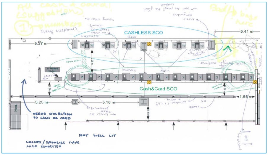
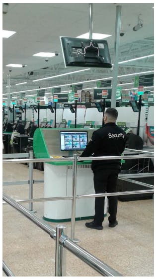
The positioning of hosts along with the size and shape of the corral, greatly affects hosts’ ability to observe in the SCO area. On the whole, hosts need to be able to see the entire SCO area from a single location or must otherwise be supported by additional staff, surveillance and security systems, or alternative layouts.
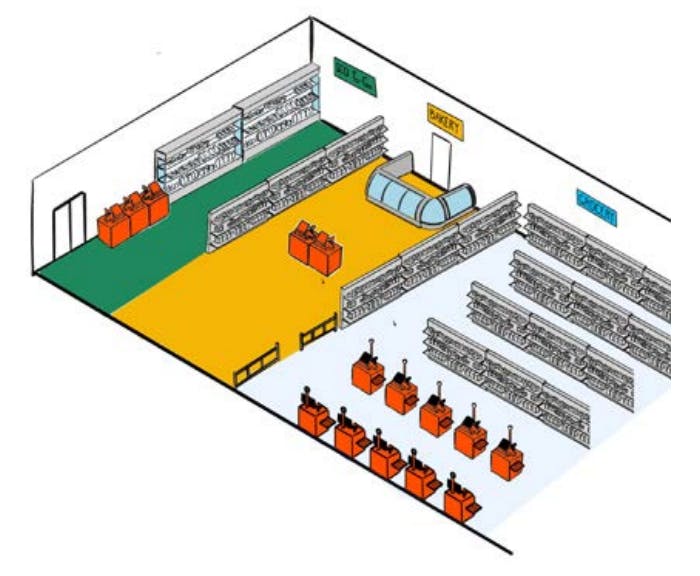
Example of how the design team and Retail staff visualised what works and what doesn’t in the SCO area. Here we marked up a diagram of the SCO layout for the store we visited. This was one of several different layout-based activities that provided context specific insights.
Evidence
“If there were two separate sections, we could each man our own and manage visibility better, [rather than have two hosts in one large section].”
Interview with staff.
During one interview a host explains to us that they actually struggle to monitor shoppers more when there is too much space between tills. The extra space creates a larger area for their eyes to scan.
Interview with staff.
“We don’t need more staff, we just need to be positioned differently.” This idea was echoed by hosts on a number of immersion visits.
Interviews with staff.
11 Key Insights: Payment Verification
The following insights illustrate issues with the payment verification at SCO. The central problem was the distinction between card and cash payments; subsidiary issues include identifying who has or has not completed a successful transaction.
6 – Payment Verification - Contactless
It’s not obvious to shoppers or hosts when the contactless transaction is complete.
At the moment, it’s difficult for shoppers and hosts alike to confirm that a transaction is complete. This causes problems for shoppers who are trying to be honest as well as shoppers abusing the system. In addition, hosts struggle to differentiate shoppers who have paid successfully from those who have encountered an error or not paid at all. This is an issue specifically to do with contactless payment where a receipt is not desired.
Evidence
“When people walk away without paying, on purpose or accidentally, it’s difficult to identify the person. The hosts may not remember exactly which one was at their till.”
Interview with staff.
“Especially on small purchases, the customer will walk away from a ‘mis-tap’ because they don’t need a receipt.”
Interview with staff.
“The issue is that people aren’t held at the SCO until payment has been confirmed, and they simply tap and leave. When this happens, staff can’t do anything because the shopper has already walked away and is either too far away or difficult to identify.”
Interview with staff.
7 – Payment Verification - Cash Vs Card
Shoppers frequently struggle to navigate to the correct till for their desired payment type, notice signage and comprehend written information around them.
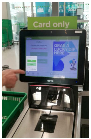
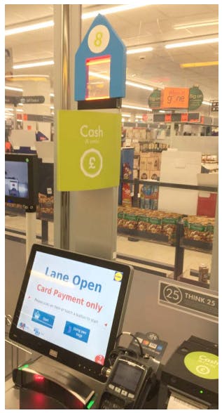
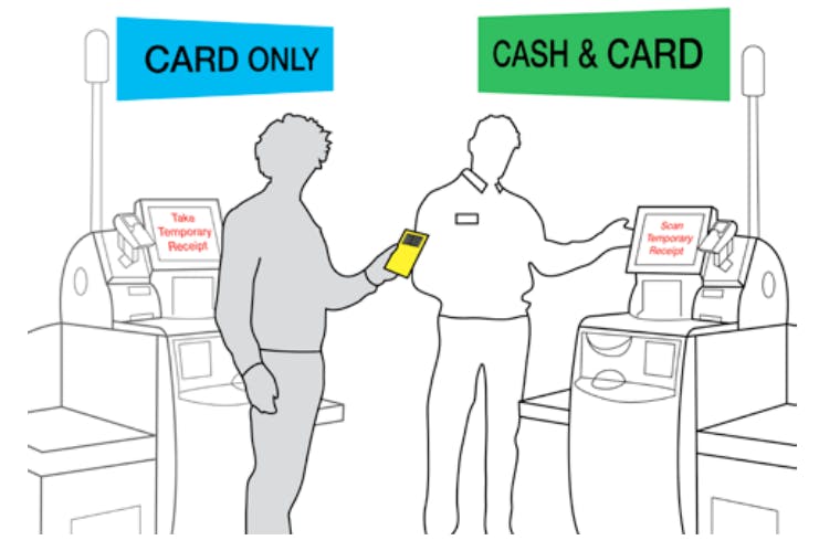
Navigation problems can account for the majority of issues in the self-checkout space. Shoppers often wait for hosts to tell them which till to use, occupying the host’s time. Or they approach tills which are out of order or fail to realise that they are using a card-only SCO when they intend to pay with cash.
Evidence
“Cash vs. card lines cause aborts, which frustrate the shopper, creates more work for the hosts and creates an opportunity for theft.”
Interview with staff.
Customers in the queue wait for self checkout hosts to direct them to an open till. This happens both during busy and quiet periods. Hosts use voice and gestures to direct customers in the queue.
In-store observations.
“No one reads the signs, they don’t realise there’s a difference [between cash vs. card only tills] until they’ve [scanned] their whole shop.”
Interview with staff.
A shopper describes the overcrowding of signage at the shop, making the signs almost useless. “There’s too much information,” they say.
Interview with a shopper.
11 Key Insights: Communication
The following insights stem from issues of communication, between hosts and shoppers, across teams at a store-level and between stores and headquarters. Many of these issues call for the need to re-focus and re-shape processes from a human-centered approach.
8 – Communication - Host & Shopper Breakdown
There are frequent breakdowns in communication between shoppers and hosts.
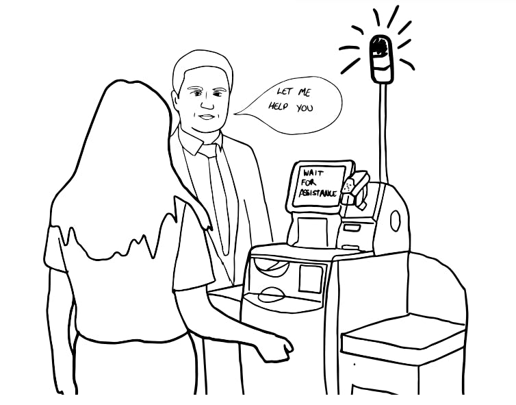
Shoppers need more transparent reassurance – that help is on the way or a host will be nearby if an issue should arise. Additionally, hosts are often subjected to disrespectful behaviour and targeted for any problems that occur during a shopper’s journey. With SCO, we’re seeing less interaction between hosts and shoppers, but we still need to encourage healthy communication, respect and support.
Evidence
In many cases, we observe hosts awkwardly peering over shoppers’ shoulders or keeping their eyes on them like a hawk.
Observed at multiple retail locations.
From interviews and observation, we learn that host uniforms which are indistinct in colour (like grey or navy) make them difficult for shoppers to spot.
From interviews and observations.
A host describes receiving “a lot of verbal abuse” from shoppers, explaining how she gets blamed when machines don’t work or if queues are too long. She’s acting “on the defence.”
Interview with staff.
“The thing is, I hate self-checkout. They don’t work properly. The software and hardware are awful. When a customer has an issue they assume it’s my fault, when actually I’m as annoyed as they are at the system.”
Interview with staff.
9 - Communication Issues - Poor Feedback Loop
Systems in place for hosts to report to management are slow and not easy to use. This creates apathy and fatigue towards these procedures.
Currently, communication between headquarters and SCO hosts is difficult, not engaging or not happening at all. In order to implement effective methods and new technology in stores, headquarters needs appropriate methods for feeding information to hosts. In addition, hosts have valuable knowledge of frequent issues, success stories, and reviews of new products, but lack adequate ways of sharing their know-how company-wide.
Evidence
As an example, we observed the traffic light system. This was implemented to improve interactions and efficiency, however, if many hosts aren’t using them this needs to be discussed and improved.
From interviews and observations at multiple retail locations.
“I could send out a newsletter, but who is going to read a list of a hundred detailed items?”
Interview with staff.
Staff create ad-hoc solutions to issues, such as creating a box for receipts or placing something on top of a till to show customers it is out of order. These solutions are only shared within individual stores, not across the company.
Interviews with staff.
10 – Communication - Untidy Spaces
Daily issues encourage ad-hoc solutions such as bespoke signage, however it often results in obtrusive designs which highlight lack of consideration and consistency of design language.
Currently, if a store manager or host recognises a need for a service or layout change, they will often take matters into their own hands, employing impromptu solutions. By engaging a design thinking perspective, Retailers can develop more considered, better designed solutions which help to solve common issues without feeling like they are an after-thought, and developing a consistent and recognisable design language.
Evidence
Queues often get out of hand, and because there is no obvious queue position, the hosts use a rope to signify where shoppers should line up. A staff member from headquarters, explains that this isn’t protocol, “They have thought this up themselves.”
From observations at Retailer A.
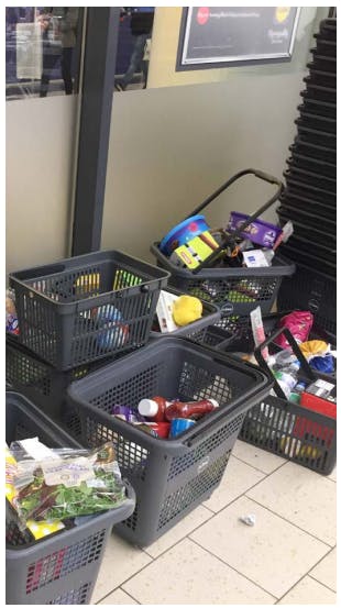
At various retail locations, we observed clutter (piled up trolleys) or wasted space (fridge doors blocked) as a result of issues being addressed in an ad-hoc, per issue manner.
From observations at multiple retail locations.
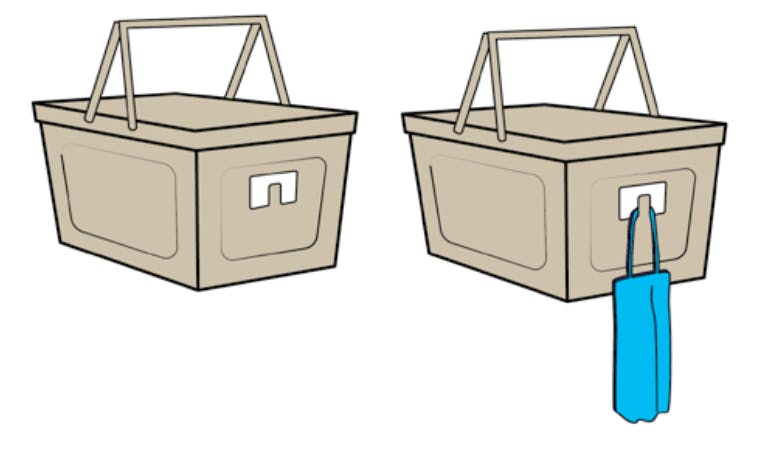
During peak hours in stores, impromptu props include neon cards and bottom up baskets to signify broken down tills. The effectiveness of these props is often questioned by the staff themselves.
From observations at multiple retail locations.
11 Key Insights: Personas
The following insight helps us understand SCO as an experience. It’s important to keep in mind the variety of people who interact with SCO, and how needs differ or change over time.
11 – Personas
Diverse shoppers have diverse needs, which must be acknowledged and addressed across the SCO process.
Retailers may gain value from better understanding the various types of shoppers who engage with self checkout. Especially as the use of SCO increases across stores, shoppers of diverse demographics will need to be taken into account for when designing SCO spaces, services, products and host training. In design, the use of ‘personas,’ or characters who are created through clustering user experiences into various ‘types’ of users, helps to bring users to the forefront of design decisions. This practice could be implemented across Retailers to shape a more human-centred SCO process.
Evidence
“I find that older people are [more open to learning] than others. They want to learn in spite of their age and then, they realize that it’s not that difficult after all. The only fear they have is forgetting an item.”
From an interview with a host at Retailer B.
“Students and young people who [only] have cash ... use the wrong lane and then have to be redirected.”
From an interview with a host at Retailer B.
During visits to various retail locations and in client meetings, we learned that while hosts have a general idea of ‘types of shoppers’, however, there isn’t yet a process for designing for, or training for, these common interactions.
From multiple observations and interviews.
Three Ways to Rethink SCO Design
- Adopt a Systematic Approach to SCO Design
- Consult Crime Prevention Thinking
- Give Design-Led Research a Seat at the Table
1) Adopt a Systematic Approach to Self-Checkout Design
Learning from Users in Context
As discussed in previous sections, we can visualise the design process via the Double Diamond framework which has clear objectives at each of the four stages: Discover, Define, Develop, Deliver. The design research process goes through periods of exploration and synthesis – constantly zooming in and out – in order to develop a grounded and well-rounded understanding of the problem from multiple perspectives. Ultimately, it is through learning in context – getting into stores – that we can inform our understanding of how we might create human-centered responses that are viable and sustainable.
In previous sections we focused on the Discover (i.e. Research) stage, discussing our observations and key insights. Now we will take a closer look at the Define and Develop stages, where we make sense of the research by building typologies, personas and journey maps, and then use these design tools to generate ideas and develop focused design responses.
How to Start Thinking Systematically About Design
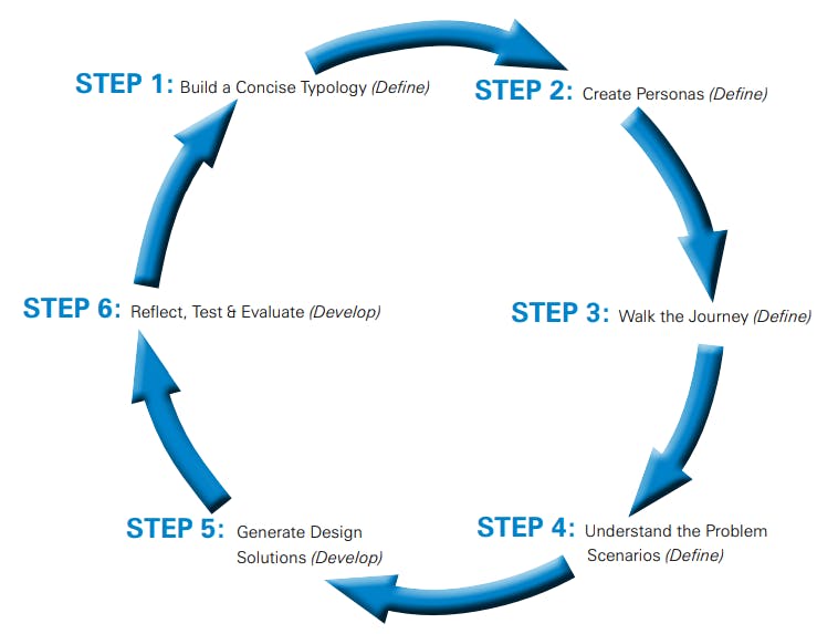
This process starts with the observations and insights you gather during your research (Discover Stage). When you have gone through Step 5, you will hopefully have created an improved journey for users, hosts and the retailer. However, this process is iterative, so you may find that the typologies, personas or journey map are not quite right the first time. Once you’re satisfied with them (you can have store staff critique and feed back on these), return to Step 3 and walk the journey from the perspective of each persona. Can you uncover new problems? Are there unintended effects of the changes you’ve made to the user journey? Explore.
Step 1 - Building a Concise Typology
What This Step is About
Understanding users is vital to any human-centred design approach. Likewise, a range of conditions across the retail environment, like store size, location and time of day, can expose and exacerbate different challenges and must therefore be taken into account. In order to do so we create and utilise typologies. The typology that we defined was a concise set of store types and conditions that could guide our thinking to address problems at SCO. It provided enough information about the different store contexts without overgeneralising and without making things too complex. Note that a store typology worked well for this particular brief and problem scope, but you might find that other retail challenges require different typologies to help manage the information.
This is What We Found
Each Retailer classifies their store types differently. For the purpose of unifying this description across all the Retailers and stores, our typology describes the relevant store sizes and conditions that bear the most significant impact on retail losses and shopper/host experiences. The resulting typology consists of a 4-part classification:
- small stores at busy periods
- small stores at calm periods
- large stores at busy periods
- large stores at calm periods
To get to this final typology, we considered many other ways of describing stores, like medium-size, urban vs. rural locations, and time of day. All of these descriptions carry some value, but not all are helpful at representing distinct SCO contexts. For example, we realised that in terms of SCO, large and small stores were fairly distinct, whereas the notion of a medium store was unclear. By discussing the research and debating these different possible contexts, we refined the descriptions to encapsulate what was distinct and relevant.
Try This
STEP 1: Research the problem and compile a list of all the factors that might affect this issue.
STEP 2: Decide which factors are relevant and distinct. Seemingly different factors might have something in common. Can these be combined? An example of this is using ‘busy’ and ‘calm’ which, for all intents and purposes, also addresses ‘time of day’ issues, but does this much more functionally.
STEP 3: Be prepared to iterate and adjust the typology throughout the design process.
Step 2 - Creating Personas
What This Step is About
From our observations, interviews and anecdotal evidence provided by the retail staff, we developed an understanding of the different experiences shoppers and hosts have with SCO systems. In a human-centred design process it is important to design for a particular set of human needs. Creating personas brings together the user-based insights into what are semi-fictional characters that embody the characteristics, needs and problems faced by groups of real users. We can then design products and services using these personas as parameters for the design. It would otherwise be impossible to create bespoke designs for each individual user. Also, from a human-centred objective, it is unhelpful and counterproductive to develop concepts for nondescript users with arbitrary needs.
This is What We Found
See pages 50-64 for full descriptions of the project’s personas and how we used them to generate design concepts.
The personas were developed by first identifying the types of people likely to be found in each of the store typologies. As part of an iterative design process, we refined the personas as we developed the other design tools (i.e. the typologies, user-journeys and problem scenarios). Due to the scope of the project brief, we ended up with quite a few personas: 8 shoppers and 3 hosts. Not all design challenges require this many personas, but when you consider the ubiquity of SCO and that most people will utilise supermarket retail services, and then account for all of the steps in this service or journey, you can see how research would uncover many distinct user experiences. Creating personas requires insights and empathy, and you can then use personas as a lens to think about how real people would interact in the retail and SCO environment. Also what would be required to improve their experience.
Try This
Step 1: Based on the research of whatever challenge you’re considering, who are the users of this product or service? What are their characteristics? What are their general routines, habits and preferences? What do they have difficulty with? What do they need?
Step 2: Are there commonalities among these different users and more importantly, what differentiates them? Try combining these insights into semi-fictional characters that are plausible and represent the challenges and needs that real people experience in the given context.
Tool: Personas
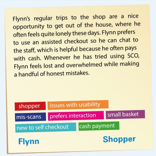
The previous insights illustrate various problems occurring in an SCO environment. To conceptualize solutions to these issues, designers often create “personas” to use as a tool throughout ideation, prototyping and even in future projects. Synthesising user research into a series of personas, or ‘characters’ representing clusters of real users, allows us to illustrate and design for diverse users with differing needs. By placing these personas within different problem scenarios, or hypothetical experiences, we are able to better understand how user needs are being met, and where improvement is necessary for the user. These stories can also help us better understand how different users interact both with each other, and with the products, services and systems in place in a retail environment. Here is one example of how a persona can be used to better understand the current self-checkout environment, build empathy with the user, and create alternative future scenarios where the issue is resolved. All of the personas generated for this project can be seen in the Appendices.
Problem Scenario: Flynn is not comfortable with using SCO.
What’s the scenario?
An elderly shopper is not comfortable using SCO machines. He has never tried using SCO because he has never been shown how. During his morning shop, a host points him towards a SCO machine as he notices the manned tills are closed. This causes Flynn to feel confused, stressed and uncomfortable, creating an opportunity for misscans at the till.
How can we resolve this scenario for Flynn?
Step 1: Learn about Flynn. Read through the persona card and notice the keywords associated with Flynn’s persona.
Step 2: Discuss Flynn’s story. Have you ever witnessed, experienced or taken part in a scenario similar to Flynn’s? Do you feel that this problem is common? Who else might encounter an issue like this? Look through the persona cards or create new personas as you see fit.
Step 3: Discuss the other key players in this scenario. How has the host played a role in this situation? Have you ever experienced this story from the host’s perspective? Look through personas and notice who else is, or could be, involved in this story.
Step 4: Brainstorm ways this scenario can be resolved. Are there certain tools or products that could help Flynn? Does another persona need to play a role in the story, supporting Flynn? What systems need to change in order to solve this issue for users like Flynn?
Step 3: Walk Through Journey
Journey Mapping: What This Step is About
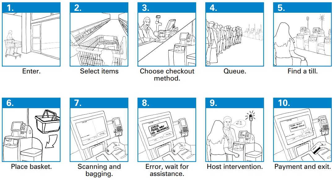
Journey mapping is a way of visualising the steps taken to accomplish a task. It highlights the sequence of actions and decisions one encounters in the given process and is an effective way to examine and design around these specific moments. With all the possible ways shoppers and hosts interact with SCO, it is helpful to organise actions into a predictable user journey, which can then be applied in various contexts. The shopper/host journey map supports a human-centred design approach because it is a way of exploring experiences at a granular level rather than generalising. For example, rather than asking, ‘How do shoppers use SCO?”, the shopper/host journey helps formulate more insightful questions like, “At the point in the journey where shoppers must locate an open till, what can be done to help the shopper navigate to the correct till without the host’s assistance?” Also, the shopper/host journey map is a means and method to manage complexity. It serves as a framework for organising the research and a means to generate insights and design responses at different stages in the journey.
This is What We Found
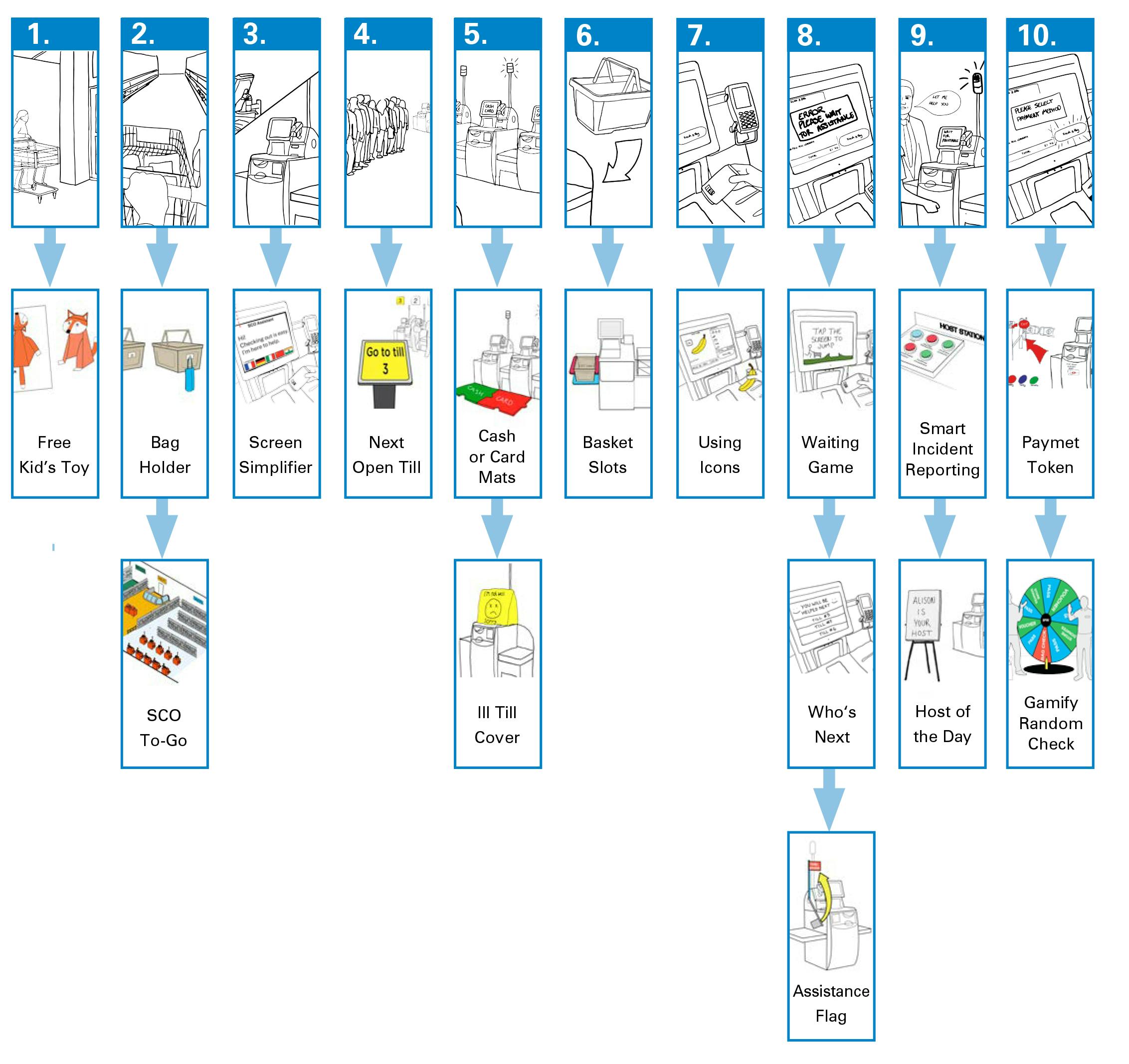
The process of shopping and self-checkout was visualised in 10 stages (see page 31). While the design team could have created a different user journey map for the shoppers and hosts, the journeys that each of these groups experience are closely connected, and visualising both in the same journey progression made the connections between shopper and host SCO experiences more apparent.
Try This
Step 1: What is the task or objective that the user is trying to accomplish?
Step 2: Write down and visualise each step of the process which that user does, from start to finish. What are the distinct steps? Try to capture when users must make a decision or perform a distinct action.
Using the shopper/host journey map
The shopper/host journey map (below) is a useful design tool for identifying problems at very specific moments and developing focused responses. The journey map works in tandem with other design tools like the store typology and user personas. Using this framework, we were able to see moments of friction in context and with greater clarity. This helped us prioritise our response based on the intensity of the problem.
Using the Design Tools Together
Step 1: Consider the user journey alongside each store typology. List the problems that occur at each step under the different store conditions. What issues are unique to a given typology? What are recurring issues, or hotspots, across multiple typologies?
Step 2: Now consider these issues from the perspective of the personas. What issues are particularly problematic for each persona? By assuming the persona’s perspective, can you identify any problem scenarios that might have been overlooked up until this point?
Step 3: [Develop Stage: Ideation page 31] From the perspective of the persona, what could be done to mitigate this problem in a way that empathises with their needs and preferences? Come up with as many ideas as possible. Do any of these ideas work well for the other personas?
Step 4: Understand Problem Scenarios
What This Step is About
Based on the research, we identified problem scenarios and challenges that occur at each step of the shopper/host journey. We examined the problem scenarios from the perspective of the personas, considering things like, ‘Is this a problem for them?’, ‘How would they react in this situation?’, and, ‘What could be put in place to resolve or mediate the issue?’ The coupling of personas with problem scenarios in this way, contributes to more focused and human-centred responses. If we were just to focus on the problem scenario, we might over-simplify the issues, or generate ideas that, for example, respond only to what we (the designer) think an average shopper or host needs, and miss opportunities to help the specific kinds of users that the problem affects most acutely.
This is What We Did – Example Problem Scenario:
[Occurring during the ‘Payment’ step of the user journey] After swiping their card and hearing a sound from the card-reader, the shopper makes their way out of the store with their items not realising that their card payment was declined. They drive off into the sunset unaware that they just got a trolley full of groceries for free.
Identifying priorities in the journey
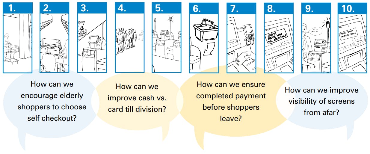
Synthesising the key challenges and problem scenarios into ‘How Can We’ statements and taking the time to visualise them in the user journey helps to refine objectives and indicate where design opportunities exist. It also helps to prioritise challenges and opportunities (see below). These concise questions reframe the observed challenges and highlight the most pressing issues into actionable objectives.
Step 5: Design Solutions
What This Step is About.
Compared to the previous step of organising data around a user journey – which is rigid and robust in order to build a framework for understanding the problem landscape – ideation is messy, exciting and for a short while prioritises quantity over quality. Ideation is essentially the process of coming up with ideas; however, this process is more fruitful when there is a clear sense of context and the people that you are ideating for. It is for this reason that we take the initial steps of creating typologies and personas.
This is What We Did
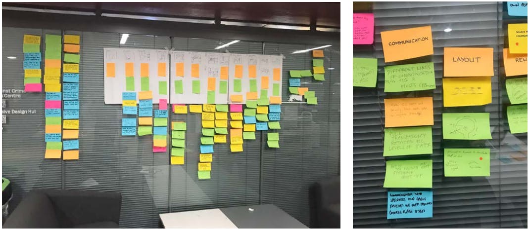
Ideation involves a great deal of post-it notes, quick sketching and rough prototyping. Over a period of just a few weeks we imagined ideas for services, products or layouts which could improve the SCO experience, based on our research insights. As we moved forward, these ideas were fine-tuned into concepts that could address the various challenges that the personas encountered at various stages in the journey. See pages 39-46 for the 20 Design Concepts.
Try This
Things to keep in mind when thinking of ideas and concepts.:
STEP 1. Ideation occurs in the ‘Develop’ stage of the process. At this point you want to think expansively and not limit your ideas. There are no bad ideas.
STEP 2. Get into the empathic mindset and design for the persona or specific ‘users’ and their needs rather than designing for what you want or what you think people want in general.
STEP 3. Ideation is not the time for finding clear solutions. While it is not bad to think pragmatically, ideas that seem like they will not work still might have an innovative aspect that could contribute to a design that does work.
Step 6: Reflect, Test and Evaluation
What This Step is About.
When we talk about design as an iterative process, this means trying ideas out and amending them to get them right before they are fully developed. We need not convince you of the value of iteration, but we hope that you will advocate experimentation and plan multiple stages of testing with your staff and customers before making shop ready prototypes and implementing them.
Trying things out early and often with rough prototypes on the shop floor is part of a thorough design process. Trying things out informally serves to get early validation from those who stand to benefit from the design and thereby mitigates risk before developing formal prototypes for public testing and evaluation. Bringing in staff and members of the public to participate and voice their opinions in the testing process is both responsive and sensible.
This report cannot give the last word or a good outline on testing and evaluation without stating the obvious. It is up to you how you undertake the informal and then formal testing and evaluation stages. On this project, a full stage of prototyping, testing and evaluation was not possible given the remit of the scope and funding. Certainly, on future fully funded projects, applying what we now know from the research and insights, we could develop more concentrated design briefs (e.g. focusing on SCO layouts and signage or SCO interfaces specifically) and extensively iterate design proposals and rough prototypes. We would also build in prototype evaluation stages – for example with shop floor staff – and then use higher fidelity prototypes with the public, which can be evaluated by independent assessors as to ensure pragmatic results. Design – especially with a human-centered focus – is a life-long learning process that acknowledges that people, technology and contexts change. To a certain degree, this requires that design work takes place in situ, and that old and new designs are reviewed and experimented with periodically to be truly “fit for purpose”.
Understanding Concepts Through the Framework of a User Journey
This diagram shows how the 20 Design Concepts in this report respond to challenges at various stages in the shopper/host journey. Our ideation session produced many ideas and concepts and the remaining concepts are a result of this iterative design process.
2) Consult Crime Prevention Thinking
Crime Science has a strong interest in converting theory and research into practical action, and does this in three ways: (1) undertaking empirical research; (2) supplying frameworks for prescribing security measures (as described by Paul Ekblom here); and (3) setting out process models for coming up with strong (evidence-based, theoretically and practically plausible) measures for the right crime problem and context, making them happen on the ground, and subsequently evaluating them to see whether they are working and/or are worth (intelligently and selectively) replicating elsewhere.
With so many context-specific factors to account for in the retail environment, there are no silver bullet solutions for eliminating retail losses and friction. With this understanding, we developed a range of concept proposals that respond to the diversity of problems that all retailers encounter in some way, and which can be selected, customised and combined to suit problem context. These concepts are product, service and layout-based solutions, and cumulatively they address the six identified problem areas: walkaways, misscans, non-scans, reducing friction, shopper and host experiences and wellbeing.
The sources of these problems are from a combination of human factors (e.g. frustration), environmental factors (e.g. blind spots), technological factors (e.g. broken SCO machines) and social factors which contribute to misuse and abuse (i.e. crime). These factors are inter-connected and therefore it is important to weigh all of them when assessing problems and generating design responses.
Applying Crime Prevention Thinking
For each concept we considered how crime prevention thinking might mitigate problematic scenarios and augment the design responses. Crime prevention thinking is conveyed through a variety of frameworks and principles that are themselves open to adaptation and modification as conditions and perpetrator techniques evolve. Consulting with DAC’s academic and crime science expert, Prof Paul Ekblom, led us to apply crime prevention principles and techniques to understand how to change circumstances so that criminal behaviour is made less likely or harmful (see Situational Crime Prevention; pages 32-37) and to understand in principle how security measures have their effect on offenders (11Ds; page 41).
As stated before, not all problem scenarios faced in Retail are crime specific. Often we found in the research that human factors like frustration and anger create or exacerbate store challenges. Thus, tackling the cause of these frustrations through a broader range of human-centered interventions is needed when anti-crime measures insufficiently address the underlying problem.
Situational Crime Prevention
A framework for evaluating designs from a security and crime science perspective
Crime Science has developed many frameworks to help practitioners (in the present case, designers and store managers) generate proposals for security interventions. As far as possible these are evidencebased, theoretically and practically plausible and suited to the problem and context whether at the level of individual store sites or across sites or regions at company level. Though we applied several crime prevention frameworks in the generation of design concepts, for this report we focus on the principles and techniques of Situational Crime Prevention.
19 Techniques of Situational Crime Prevention for SCO
Situational Crime Prevention (SCP) is a major approach within Crime Science. While conventional criminology focuses on understanding and seeking to influence why and how individuals become criminals, and what motivates them, SCP takes such criminality as a given. Instead, it identifies and focuses on crime problems as distinctive concentrations of criminal events occurring at particular (kinds of) places and times. It aims simply to reduce the likelihood of those criminal events and the harm they cause, by advance action to alter the immediate circumstances in which those events may occur.
Whilst context is everything in terms of understanding how to reduce crime, once perpetrator techniques at SCO are understood, there are five prevention strategies that could be used to improve crime prevention. These include:
- Increasing the effort the offender must make to carry out the crime.
- Increasing the risks the offender must face in completing the crime.
- Reducing the rewards or benefits the offender expects to obtain from the crime.
- Removing excuses that offenders may use to “rationalise” or justify their actions.
- Reducing or avoiding provocations that may tempt or incite offenders into criminal acts.
These five broad approaches have been incorporated into the list of 19 Techniques of Situational Crime Prevention for SCO1 that follows. These can work as prompts for you to consider whether or not the SCO crimes you are dealing with can be addressed in this way, or whether or not these prompts can inspire new innovations from you to deliver crime prevention.
19 Techniques of Situational Crime Prevention for SCO
Category #1: Increase the Effort
- Target Harden
Make merchandise which is the target of theft or fraud, and its packaging, more resistant to theft and deception, so the offender does not benefit by avoiding or reducing payment.
SCO Prompts & Recommendations
Ensure price labels can’t be swapped - Control Access
Check customers either on entering the store, or entering the SCO area – are they excluded individuals, are they already under suspicion, are they currently behaving suspiciously?
SCO Prompts & Recommendations
Keep shoppers with dodgy transaction records out of the store or make them use regular checkout tills. - Screen Exits
Check customers upon exiting the store or exiting the SCO area. Are they excluded individuals, are they already under suspicion, are they currently behaving suspiciously?
SCO Prompts & Recommendations
--> Ticket receipt needed for exit.
--> Electronic merchandise tags.
--> Meet and greet systems at entrances and exits.
--> Token needed for exit that can also be used as part of a donation (see ‘Payment Token’ Design Concept) - Control Tools
Ensure customers can’t bring in, or use, any equipment to fool the scanner or fool the host that everything has been passed through the scanner (foil-lined bags are notorious for this).
SCO Prompts & Recommendations
AI computer vision technology and machine learning software and hardware used to monitor SCO transactions.
Category #2: Increase Risk
- Natural Surveillance
Ensure that the physical, procedural and electronic environment, and the merchandise and its packaging, make it easy for guardians/ place managers (professional security staff and others) to detect and collect evidence on suspicious behaviour, in ways that are timely, retrievable and reliable.
SCO Examples & Prompts
• Block trolleys from entering restricted SCO areas to improve visibility.
• Locate SCOs so that other store staff (not just hosts) have visibility of the SCO area.
• Make scanned item visible and large on the SCO screen. (see Design Concepts)
• Consider smaller designated zones with their own SCO area (see ‘SCO To-Go’ Design Concept) - Formal Surveillance
Ensure that the physical, procedural and electronic environment, and the merchandise and its packaging, make it easy for guardians (professional security staff and others) to detect and collect evidence on suspicious behaviour, and to respond as appropriate.
SCO Examples & Prompts
• Deploy security guards and familiarise them with current/emerging perpetrator techniques.
• Use advanced AI computer vision technology (e.g. NCR’s surveillance technology and communication)
• Use machine learning of perpetrator techniques (e.g. hand movements, etc.) - Reduce Anonymity
Make it difficult for offenders to undertake the SCO transaction without being identifiable at the time, or traceable later. Making offenders feel identifiable will amplify the effect.
SCO Examples & Prompts
• Set up and encourage loyalty cards.
• Ensure the screens at SCO show the customer during checkout (however, our research suggests this is an ineffective deterrent).
• Make scanned items visible and large on the SCO screen (see ‘Use Icons’ Design Concept). - Proper Place Managers
Ensure that various people – security staff, SCO hosts, other staff, other customers in the queue – are (as applicable) alerted, informed, motivated, empowered and directed to assume responsibility for encouraging and assisting the installation, maintenance and proper use of the totality of security measures and practices.
SCO Examples & Prompts
• Create a zoning system that establishes a well-demarcated area of surveillance and customer service for the hosts.
• Support hosts quickly and easily document incidents (see ‘Smart Incident Reporting’ Design Concept). - Extending Guardianship
Ensure that various people – primarily customers – are alerted, informed, motivated, empowered and directed to assume responsibility for looking out for suspicious behaviour and taking appropriate action.
SCO Examples & Prompts
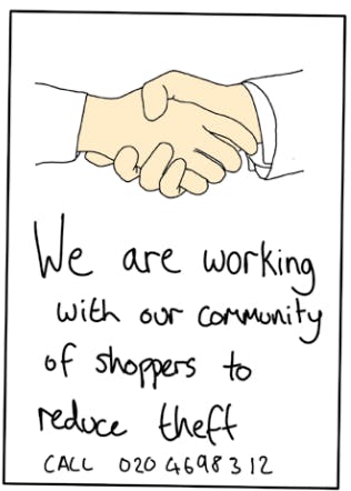
• Store campaign encouraging shoppers to report suspicious behaviour to staff (see ‘Neighbourhood Watch’ Design Concept).
Category #3: Reduce the Rewards
- Remove Targets
Exclude some items – high-value or at elevated risk of loss – from being transacted by SCO
SCO Examples & Prompts
• No loose bakery items or nuts.
• Alcohol purchases require verification and could have their own kiosk.
Category #4: Reduce Risks
- Assist Compliance
Make it easy and stress-free for shoppers simply to do the right thing in transactions.
SCO Examples & Prompts
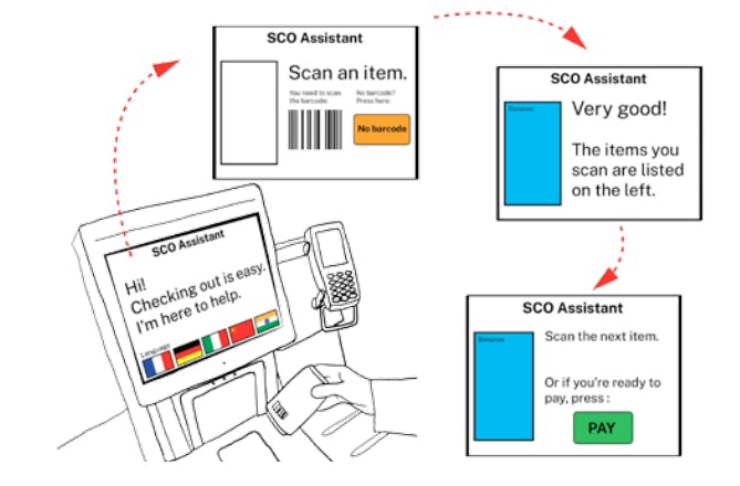
• For shoppers in need of help throughout checkout, simplify the checkout interface with an optional mode that walks the shopper through the SCO steps (see ‘Digital Assistant’ Design Concept)
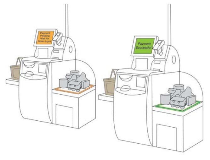
• Create a more obvious visual cue to signify that payment is approved and transaction is complete (see ‘Payment Assurance Light’ Design Concept) - Post Instructions
Develop a clear and accessible process, and use communications media to guide and support honest/careful transactions; highlight ‘points of no return’ (e.g. ‘by this point, you should have paid for everything, if not, please go back’)
SCO Examples & Prompts
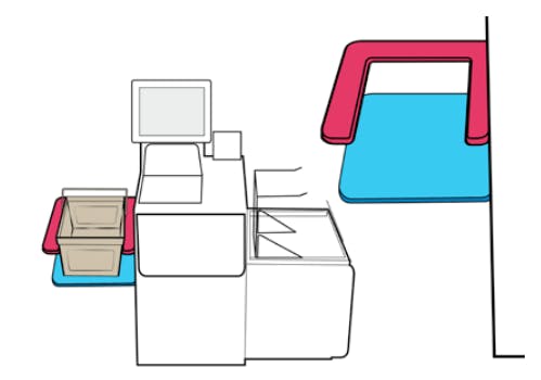
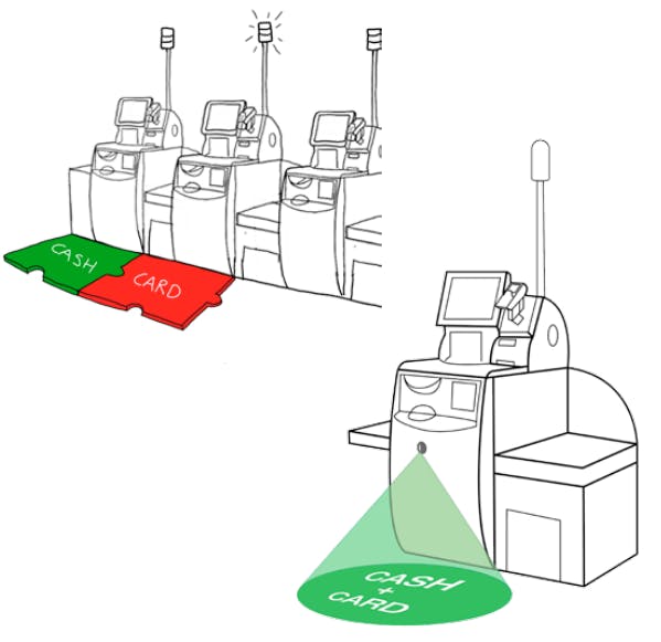
• Use floors mats or a projection system onto the floor to clearly show if a till accepts cash or card (see ‘Cash vs Card Mats’ Design Concept) - Alert Conscience
Make offenders feel uncomfortable about contemplating theft or fraudulent SCO transactions by appealing to morality, empathy with staff and wider harmful consequences of the crime; boost social norms (within their peer group and more generally) that view fraudulent transactions as socially impermissible; deliberately seek to demolish ‘neutralisation’ techniques used by offenders to protect their conscience (‘everyone’s doing theft’, etc)
SCO Examples & Prompts
• Till monitor showing shopper during checkout.
• Screensaver when waiting for assistance that encourages donations to a charitable organisation (see ‘Charity Screensaver’ Design Concept) - Set Rules
Develop a clear set of rules stating what is unacceptable behaviour by customers, and use communications media to guide and support honest/careful transactions; highlight ‘points of no return’ (e.g. ‘by this point, you should have paid for everything, if not, please go back’)
SCO Examples & Prompts
• Digital assistant option at tills to guide inexperienced SCO shoppers throughout checkout.
Category #5: Reduce Provocations
- Reduce Frustrations and Other Emotions
Reduce any frustrations or other sources of stress that shoppers might experience during SCO which may provoke them to skip payment, and boost any mitigating influences, e.g. pre-establishing good relations between staff and customers.
SCO Examples & Prompts
• Install soothing music/muted lights.
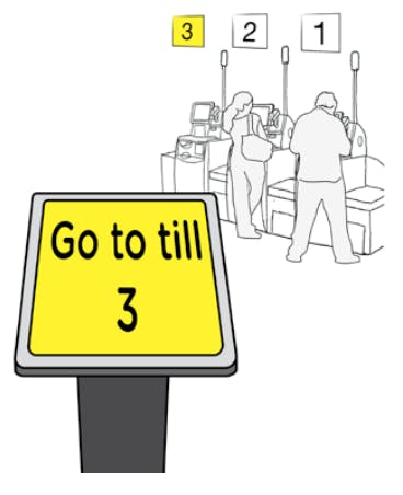
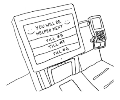
• Install automated system telling customers which till to go to (see ‘Next Open Till’ Design Concept)
• Clearly mark out-of-order SCO machines (see ‘Ill Till Cover’ Design Concept)
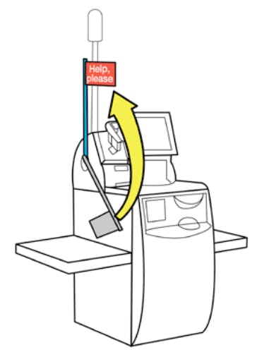
• Assure customers that assistance is on the way.
• Reduce and minimize false interventions by use of smart technology (e.g. NCR’s video recognition based intervention reduction technology) - Avoid Disputes
Design SCO systems/procedures to minimise the risk of disputed transactions; train staff to avoid or to de-escalate disputes where possible/appropriate, and avoid unnecessary provocation
SCO Examples & Prompts
• Install automated system telling customers which till to go to (see ‘Next Open Till’ Design Concept)
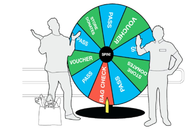
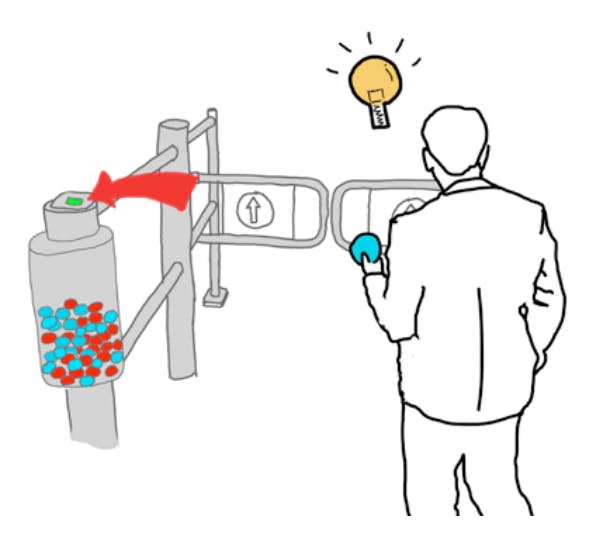
• Randomised checks before exit so that customers know they aren’t being targeted (see ‘Gamify Randomised Checks’ Design Concepts). This process could be sweetened with randomised winning of shopping vouchers.
• Automatically present host and shopper video evidence of any potentially suspicious actions (such as identified by NCR’s computer vision technology) - Reduce Emotions
Reduce any sources of stress and agitation that shoppers might experience during or before SCO which may provoke them to skip payment, and boost any mitigating influences, e.g. pre-establishing good relations between staff and customers.
SCO Examples & Prompts
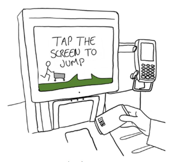
• Help customers waiting for assistance briefly pass the time with a game on the SCO screen (see ‘Waiting Game’ Design Concept)
• Humanise the SCO experience by finding ways to humanise and show appreciation for the hosts (see ‘Host of the Day’ Design Concept). - Neutralise Peer Pressure
Reduce the pressures from other customers or possibly staff to speed up a transaction, thereby increasing stress and possible errors; reduce pressures among particular peer groups inciting or permitting people to offend.
SCO Examples & Prompts
• Limit the number of people in a group allowed at the SCO machine during checkout. - Discourage Imitation
Deter people from imitating thieves and fraudsters by highlighting examples of other shoppers being caught.
SCO Examples & Prompts
• Humorously acknowledge that the store and staff are aware of shoplifting techniques (without teaching thieves new tricks).
3) Give Designers a Seat at the Table
Investing in Design
Design can deliver the sort of creativity needed in stores that will look good on the eye, increase spend at the checkout, and work to thwart thieves. This is unlikely to be delivered by ideas and methods from crime prevention alone, or from short-term retail thinking or technological reliance.
Design can provide a paradigm shift, that helps see and resolve problems in new ways. Designers can cope with complexity and uncertainty and design sprints can provide a paradigm shift, that helps see and resolve problems in new ways. But designers need to be given as much respect as crime science, security or retail consultants. Design is not the bit that should simply be added on at the end to the design against crime process. To find robust solutions to the many challenges faced at SCO, “design thinking” needs to be part of the whole process so designers can identify the multiple drivers at an early stage of development and do their best to address them.
Simple Ways to Advocate and Implement a Design-Led Approach
- Train innovation teams in human-centered design methodology. We recommend using approaches that involve participatory and collaborative practices.
- Hire user researchers, service designers, and design facilitators who can implement a design-led approach to better understand staff and consumer performance.
- Use the steps and methodology covered in the previous sections as a blueprint for addressing existing and emerging challenges in retail.
Contributions of Design-Led Research and Socially Responsive Design
As a research centre, DAC contributes a design led research approach that is collaborative, inclusive, equitable and open. DAC’s participatory and collaborative methods are not ubiquitous across professional design practices. The value we bring is derived from the co-articulation of possible futures and priorities through collaborative action research. This process creates shared understandings of complex problems working in collaboration with diverse sectoral actors. In doing this, our projects translate problems into design briefs which fully articulate the requirements of future products and services needed. We ensure that our briefs appropriately respond to challenges whilst accounting for social, technological, cultural, environmental and political factors. Inherent to the collaborative design process, we ensure products and services created are reviewed, commented upon and validated early on by variety of stakeholders who stand to use and benefit from these products and services. This early validation process serves to mitigate risk.
Value-Creation Through Design Partnerships
Understanding DAC’s contribution through the lens of our collaborative design-led research process (i.e. visualised in the Double Diamond framework; see page 21), can be helpful. We can see that DAC’s contribution is in the front end – the Discover and Define stages– of the wider process of realisation of partner objectives. This is where investment is most needed because it is here where sense making to address difficult, tricky and complex challenges is most needed. Certainly, the front end of the design process can be messy, but design iteration enables strong articulation and clarity to emerge. All of this is to be sure about what is actually needed. Once it is clear what to design, having determined what the best options are for the client, then delivery and evaluation are possible.
Working with cross sector partners in this way, when projects are heading towards completion, DAC is accustomed to creating open source design resources that are made available to businesses to inform and support appropriate product and service innovation. On occasion, we go as far as co-developing and delivering prototype product and service solutions that are then licensed to industrial partners within the project. Partners beyond academia are best placed to develop (prototypes) and deliver (final products and services) responses to these design questions, releasing value in their realisation.
Design Thinking in Practice
DAC Design Outputs that Came from Using a Design Thinking Methodology
ATM Mats
Partnered with Lloyds Bank
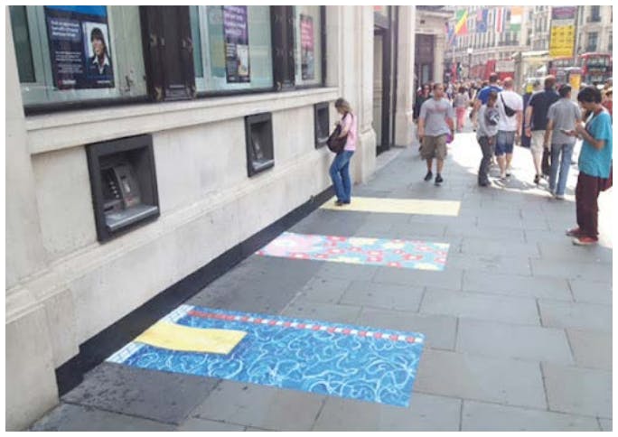
Working with Lloyds Bank, ATM art mats that look attractive and that direct spatial distancing to protect PINS from fraudsters, were produced by DAC. This inspired copycat “stand here” feet printed on floors of train stations and shopping malls where some ATM machines are located, long before COVID-19.
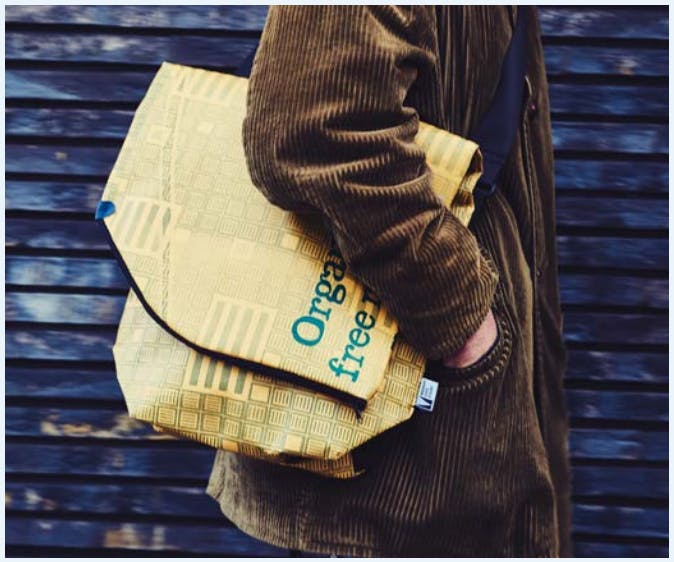
Makeright Anti-Theft Bags
Partnered with HMP Thameside
Working with HM Prison Thameside, Makeright anti-theft bags were collaboratively designed with prisoners to raise profits for charity when sold. Recycled lorry tarp donated by Abel & Cole was used as the bag material. The Makeright project sent a positive message from prison back into society about ways to rehabilitate and repair harm from crime in line with restorative justice objectives.
TFL CaMden Bike Stands
Partnered with TFL and Camden Council
Working with Transport for London and Camden Council, M shaped ‘CaMden’ bike stands were designed to promote secure locking with a shape that makes it easy to use two locks to secure both wheels and frame to the stand. Also, they are simple to install and maintain. Dissemination of this information has led other boroughs to adopt similar design elements in their bike stands.
20 Design Concepts
The 20 design concepts featured in this report are the top design concepts according to the Retailers’ feedback at the ECR Self-Checkout Innovation Conference (Feb 2020).
These concepts have been grouped into three areas of benefit that describe how the designs can:
- Improve SCO Participation – Encourage more customers to use SCO.
- Improve Scan Accuracy – Reduce mis-scan, non-scans and other forms of misuse and abuse that contribute to retail loss.
- Improve Customer Experience – Reduce friction, frustrations and walkaways.
Improve Participation
Ill Till Cover
A playful cover to clearly indicate when an SCO till is out of order. By using a larger, visual but gentle cue, shoppers can see which tills are out of order from distance, rather than waiting until they approach the screen. This can be indicated in various ways. We strongly recommend using physical objects (such as a textile cover) as opposed to digital signage as this is easily ignored by shoppers.
Improves Upon
Navigation
- Helps shoppers choose a working till from afar.
Efficiency
- Reduces frustration by improving efficiency.
- Reduces number of tasks for hosts.
Host of the Day Board
A sign informing shoppers of their host’s name on a given day, encourages more personal host-shopper interactions while diffusing tension in the SCO space. In addition, this tool may provide hosts with a greater sense of ownership, empowering hosts to act with integrity and pride. This sign could be simply hand-written on a template or alternatively digitised, in order to handle shift changes more efficiently.
Improves Upon
Communication
- Decreases tension by humanising the host intervention experience.
- Increases host’s ownership of the SCO area.
Next Open Till
This automated sign could be displayed at the front of a queue, directing shoppers to the next available till, in order to improve customer flow at SCO. This sign would also reduce the number of tasks performed by hosts, providing organisation and autonomy to shoppers in the queue. In addition, this display would provide a natural and clear delineation between the front of the queue and SCO area, reducing spillover and overcrowding in the space.
Improves Upon
Communication
- Signals a call to action for shoppers and members of the community.
- Establishes a culture of honesty, security and support.
Shopping Bag Holder
As customers shop, their personal shopping bags can get buried underneath their items. This basket hook makes it easier for shoppers to access their bag as they begin their checkout process. While helping to improve efficiency for the shopper, this product also supports the entire SCO area by ensuring things run smoothly, queues stay short, and there are fewer distractions for busy hosts. Existing baskets and trolleys can be adapted or fitted to include a bag holder, rather than creating completely new baskets and trolleys.
Improves Upon
Usability
- Improves organisation at the till.
Efficiency
- Improves the speed and organisation of the checkout process.
Improve Scan Accuracy
Using Icons
Using large visual icons, instead of words, to improve the customer interface for users as well as hosts, who can now see the screens from farther away. By showing each item scanned, staff can check whether mis-scans have occurred through matching the icon on screen to the item in a customer’s hand. Shoppers will be able to check that they have scanned and bagged the correct item while deterring theft through publicising the item being scanned. There may be scope for linking this data with camera-based product detection technology.
Improves Upon
Usability
- Easier for shoppers to know what’s been scanned.
Communication
- Increases surveillance as hosts can monitor interfaces from afar.
SCO To-Go
This layout aims to redirect congestion by compartmentalising the shop, with certain sections containing their own SCO area. One section of a shop may be catered towards quick bites and onthe-go purchases. Another section may carry items which require special assistance due to barcoding, such as bakery goods, loose fruits and vegetables, and bulk sections with nuts, grains and cereals – with emphasis on items which are commonly subject to theft. Concentrating “problems items” would improve efficiency for shoppers and support better monitoring by hosts.
Improves Upon
Efficiency
- Improves speed at which shoppers navigate the shop looking for snacks of take-away items.
- Reduces queue times as shoppers with small baskets aren’t waiting behind those with large baskets.
- Improves processes in other parts of the shop
Digital Assistant
Many shoppers regularly require or seek assistance during self-checkout and these encounters keep hosts from effectively assisting other shoppers or managing the checkout area. This simplified self-checkout interface helps to reduce ‘noise’ and confusion caused by non-essential elements on the screen and the step-by-step instruction helps technology-timid or inexperienced shoppers to easily navigate the process. This mode would be optional, but nevertheless usable to all demographics, meaning children could participate in self-checkout at well.
Improves Upon
Usability
- Emphasises key features of the interface and a step-by-step guide to assist throughout checkout.
Efficiency
- Reduces confusion and need for host assistance.
Waiting Game
While waiting for assistance during checkout, shoppers could be prompted to play an optional, simple game on the SCO interface. This creates an opportunity for retailers to let customers know about special offers while engaging with shoppers while they wait. This would only be suggested as an option, as not all shoppers would want to engage with the game. It could be connected to random prizes or discounts.
Improves Upon
Communication
- Opportunity to engage with shoppers with a fun and exciting touchpoint.
- Reduces shopper frustration which results in improved experience with hosts and shop as a whole.
Assistance Flag
For shoppers who shy away from interaction with hosts, the use of a physical cue, like a flag, helps shoppers feel more comfortable seeking assistance. This feature mitigates tension between shoppers and hosts by providing a polite way for people to ask for help without feeling stupid, guilty, or awkward when calling the host over. At the same time, it provides shoppers with the reassurance that a host will come to assist.
Improves Upon
Communication
- Clear signalling improves communication between hosts and shoppers.
Efficiency
- Obvious visual cues help hosts assist shoppers quickly.
You’ll Be Helped Next
This digitised list indicates which shopper will be helped next. This feature aims to improve transparency and help defuse shopper frustration by providing clarity and assurance. Hosts could use a handheld device to monitor the list and move through in sequential order.
Improves Upon
Communication
- Brings a sense of transparency and fairness to waiting times and host interventions.
Smart Incident Reporting
This tool for collecting quantitative and qualitative data can be used by SCO hosts during their shift on the floor. Gathering information about issues from hosts as they occur provides a more accurate indicator of SCO pain-points for management to assess and respond to efficiently. This feedback mechanism could be analogue for ease of use, or it could be digital, for monitoring more involved metrics or flexible programming. As issues are logged often and accurately, management can use the information to develop solutions and mitigate problems that might bear an impact on retail losses.
Improves Upon
Communication
- Creates a method for tracking various metrics.
- Gives hosts agency to raise concerns or relay feedback.
Efficiency
- Improved the speed and accuracy at which issues are reported.
Basket Slot
It is a common error for shoppers to begin their checkout by placing their basket or items on the scale before scanning. Adding slots onto the basket area of the till may help shoppers make a distinction between the basket area and bagging area or weighing table. This basket slot would use obvious physical affordances to indicate to the shopper how it should be used without the need for signage. As basket sizes vary across and within retailers, the slot would need to be flexible. The design of the slot could either be easily adjustable or customised for different types of tills and basket.
Improves Upon
Efficiency
- Reduces number of interventions caused by misplaced baskets.
Usability
- Doesn’t require additional signage around the till, as the shape of the basket slot indicates the correct side.
Gamify Random Checks
A gamified system could be used to conduct random checks in a transparent and honest manner, reassuring shoppers and staff they are not being targeted or profiled. Before leaving from work or after paying for their shopping, staff and shoppers, respectively, must play a quick game of chance to see if they need to get their bags checked or win a prize. This process is worth their while because they are given supermarket rewards when found “error free.” There are many possible ways to gamifying this process, such as, a roulette wheel or a slot machine. Analog systems add a level of transparency and honesty.
Improves Upon
Communication
- Gamifies process in order to make checks feel “random” and less targeted or based on demographics.
- Makes interventions less awkward as it is clearly understood as standard procedure and that there might be a reward from engaging.
Free Kids Toy
Children create a significant distraction in a shopper’s journey, both while selecting items and during the checkout process. This modest, free toy occupies children and, in turn, reduces the number of mistakes a shopper makes as a result of distraction. In addition, parents have been found stealing items for their children, such as toys, so this small gesture may motivate shoppers to refrain from stealing. Using low-cost, recyclable materials, making simple designs that are unique to a store’s location, would help maintain a level of novelty and brand identity.
Improves Upon
Communication
- Opportunity for stores to express a local identity.
- Possible to drive loyalty and draw in shoppers.
Efficiency
- Occupies children to reduce shopper distractions.
Reduce Walkaways
Temporary Receipt
If a shopper checks out at a card-only till, only later realising they need to pay with cash, the host can print a temporary receipt which the shopper can take to another cash till and complete the transaction. The temporary receipt would need to be easily distinguishable from a payment receipt, in order to avoid potential honest or dishonest mistakes. This system would aim to reduce walkaways and allow for better tracking of aborts.
Improves Upon
Usability
- Streamlines transactions between different types of SCO.
Efficiency
- Reduces the need for a shopper to re-join the queue and begin the process over again.
Cash vs. Card Mats
Mats on the floor can be used to clearly indicate which tills are card only in the SCO area. Signage on the walls or above tills is often ignored or goes unnoticed. By making use of the floor space, the information is more noticeable in an environment that often has an overabundance of signage at eyelevel. These mats could be made as vinyl stickers, foam pieces or digital projections onto floors. In order to adapt to changing conditions, mats could be double-sided and modular.
Improves Upon
Efficiency
- Improves queue times and customer flow in the area.
- Reduces the number of tasks for hosts.
Navigation
- Improves wayfinding as a shopper approaches a till.
Neighbourhood Watch
Posters displayed in stores highlight that this is a community of shoppers who look out for strange behaviour; a number is available to call for anonymous help. These posters aim to appeal to peoples’ better judgement, showing how stealing negatively impacts a community. This stimulus impacts shoppers who may steal off the cuff, by instilling a sense of being watched and making the consequences of stealing more apparent. With this recommendation comes caution against overwhelming a store with these posters. An overabundance of such communication may be negative. It could make the environment seem more threatening than it actually is, and perhaps friendly eyes watching could be a theme to develop.
Improves Upon
Communication
- Signals a call to action for shoppers and members of the community.
- Establishes a culture of honesty, security and support.
Payment Assurance Light
After scanning all their items, a shopper selects a payment method and orange light begins to blink on the bagging area. A message appears on the user’s screen, as well as a voice message stating, “Please don’t take your shopping until the light turns green”. After the payment authorised successfully, the light turns green and stops blinking, while a message states, “Thank you, you can now take your shopping. Goodbye.” This system can be integrated with existing SCO machines by using a spotlight which shines down on the bagging area.
Improves Upon
Communication
- Creates a clear signifier and provides an additional level of confirmation.
Usability
- Ensures shopper will not leave until payment is authorised.
Payment Tokens
Currently, some stores require shoppers to scan barcodes on their receipts in order to pass through exit barriers. In some cases, this has proven to be a problematic process. With this option, reusable plastic tokens are dispensed from the till after checkout is complete, the shopper then uses these tokens to exit the checkout area. In addition to being used for exit, shoppers could have the option of placing their token in one of several ‘buckets’, each for a different charity or organisation that the retailer supports. A percentage of proceeds would be donated depending on the number of coins in the bucket.
Improves Upon
Usability
- Simplifies the receipt scanning system
Communication
- Makes store’s altruism more visible, as well as shoppers feeling a sense of reward for contributing.
Charity Screensaver
Information campaign to inform shoppers how the Retailer supports humane causes. This can also be an opportunity to educate people about the negative impacts of stealing in order to appeal to their good nature. One example might be, “Every 100 avocados we lose to theft, is £250.00 we could be donating to ‘WaterAid’. Stealing limits what we can do for our community and our planet.” Signage throughout the shopping journey could help support the campaign, making it more apparent to shoppers.
Improves Upon
Communication
- Communicates and educates shoppers about charitable partnerships.
- Improves shoppers’ perception of retailers.
Conclusions
Whilst retailers invest heavily in upgrading stores and technology, this report suggests the key to improving the customer experience and reducing retail losses concerns a better understanding of the interactions between people, technology and the design environment – because the recognition that “context is everything” has design ramifications. Retail environments vary greatly, and factors like and store location, store size, layout, layout of SCO, location of SCO in store, time of day, technology, age of shoppers, language/cultural difference, and basket size all contribute to a diversity of problems that each store encounters differently. The design of SCO environments cannot and should not be churned out from fixed “cookbook” recipes, or reliance on machine upgrades, but instead needs to be customized, trialled and adjusted to each individual retail site.
Of course, best SCO design is not easy. And so trialling things before rolling them out is part of any design process. The problem landscape is undeniably complex and requires an amalgamation of technological and human-centred interventions and experiments. For example, investment in AI computer vision systems may help reduce some problems, and certainly video evidence of customer behaviour provides persuasive information that can contribute to staff training. But adjusting the way we respond to challenges through the lens of design thinking and design iteration is a strong option too and will help address the contextual specificity in stores needed to deliver user-friendly sustainable solutions. In an environment and industry that relies so heavily upon direct interaction with its customers, clear communication will have profound effects.
Introducing design thinking and crime prevention techniques to the SCO process is important to getting it right, whether for new store layouts or retrofit adaptation/improvement of existing sites. Given existing and future SCO contexts are always changing – new technology, different business practices, and not least, innovative and adaptive criminals – all mean that carefully pre-planning and re-planning of design responses is needed, because there are no off the shelf silver bullet design solutions that will work in the same way for every store for all time.
The approach taken in this report has been deliberately developed to respond to a diversity of shoppers and retail environments. Ultimately, it’s up to Retailers to understand that employing designers as well as machines can make a difference, and also to choose wisely how to do this and understand what aspects of user experience at machines needs to be improved, by design. Therefore, the big takeaway of this report is not just the 20 Design Concepts themselves, but rather the call to rethink your approach to designing SCO. Here is what you can do to get started:
Recommended Actions
Things to Consider Moving Forward
If you see the incorporation of human-centred design and design-led research as inherent to creating responsive and sustainable solutions to the problems faced in retail, then there are several early and pragmatic steps that can be taken to incorporate design thinking into retail practices, processes and products are:
- Conduct a survey of SCO supervisors to get opinions on what’s working, etc. An ideas box, but also use “immersion” processes to see things differently.
Store staff are the experts of the retail environment. They are the eyes and ears of the store, and their experiential knowledge of what works and what currently doesn’t is vital to any process of improvement and innovation. Part of the task is making people comfortable voicing their opinions and motivated to engage in a meaningful way, as often times insights are not apparent until you dig deep into the conversations or observations. Employing designers to immerse themselves in retail culture and feedback what they see and hear your staff saying may help you “see” things differently about what needs to be improved. Also, designers can often help shop floor staff better articulate any ideas that want to put forward, based on their experience, to make improvements to your service. - Share the report with the other stakeholders internally and propose that a joint team visits some stores, does part of a shift as a SCO supervisor and recreates the journey, personas, points of vulnerability, etc…
We encourage you to explore what might be learned by applying these design methods, tools and framework with stakeholders internally and with other known problems. You can start by using the shopper/journey framework that we provided or create your own amongst your staff that’s adapted to the systems in question. Together, you can break down processes into their fundamental steps, and pinpoint problems and challenges at these specific moments to see how the challenges arise in a network of actors (i.e people, products and services). - For future projects, consider hiring or consulting designers specialising in socially responsive design-led research and human-centered design methods.
Bringing in designers and other cross-sector knowledge holders can catalyse new conversations and insights that help define the ‘right questions’. Research centres like DAC and designers who utilise participatory methodology, can help manage this complex process and design the research and design tools that uncover and harness the knowledge contained in the retail environment. Introducing new ways of thinking about and framing challenges with a broad community of stakeholders can bring about innovation that creates both market value and social value.
Work with Designers?
The Design Against Crime Research Centre team wants to hear from you.
You can access our creative team, design thinking facilitation, and tap into our global network and diverse community of students and graduates through:
Paid Designer Internships – Support our emerging design students or graduates, those located in London as well as diverse parts of the world, to apply their skills and talent to benefit your business and develop their practice.
Graduate projects – One or more graduates are employed by us, based on your needs, guided by our expert academics who have co -produced this document to design context-specific solutions for your business.
Knowledge transfer partnerships – The UK government supports up to 67% of the costs to UK business of employing a graduate, under the mentorship of our academics, to support your business in making a transformational step-change.
Invest in training your managers to better understand and apply “design thinking” – our Social Design Institute colleagues (led by Jocelyn Bailey who regularly works with the DAC staff who authored this report) could create especially for your managerial and other staff a design thinking short course or training day to help them understand how to better apply the ideas this report has outlined. This would help support your staff on the creative journey to apply design thinking to envisage innovative solutions to better address self-checkout challenges.
Talk to our Business Development and Social Innovation Manager, Chryssi, to find out more!
Chryssi Tzanetou
Business Development Manager, Social Innovation
c.tzanetou@arts.ac.uk
Tel: +44 (0) 7792930424
Appendices
FURTHER INFORMATION AND REFERENCES ABOUT CRIME FRAMEWORKS AND DESIGN THINKING
A.1 - Shopper and Staff Personas
The following eleven user personas were created as part of our synthesis of the research. Each persona includes a list of key terms (from the word bank below) summarising key user characteristics and needs.
Samudra shops for a family of six and likes to take advantage of discount days at the larger shop near her house. She always comes to the shops prepared and prides herself on being an organised shopper. She’s been living in the country for a long time, but she is often perceived as “not being local” which leaves her feeling patronized and unwelcome. Because of this, she tries to avoid interacting with people while shopping.
Flynn’s regular trips to the shop are a nice opportunity to get out of the house, where he often feels quite lonely these days. Flynn prefers to use an assisted checkout so he can chat to the staff, which is helpful because he often pays with cash. Whenever he has tried using SCO, Flynn feels lost and overwhelmed while making a handful of honest mistakes.
Leo is bored of his working professional routine and looking for a bit of excitement wherever he can find it. Lately, he’s been getting a kick out of nicking a few things here and there from the supermarket. He’s often already there during busy lunch periods, and he’s starting to realise how easy it is to pocket a few things. Soon he’ll try for something more risky.
Matt regards himself as a good person. He’s in his second year at University and everyday he goes to the same supermarket for lunch, usually just grabbing a sandwich and a juice. Often in a rush, Matt usually ends up in a long queue. He’s very frustrated with how much time he wastes at the shop, which can often cause him to pocket items while he waits in line.
Every Saturday, Daisy heads to the shops with her energetic twins in tow. Her kids love to distract her by running off and grabbing things off the shelves, which means she can end up spending over an hour in the store. She prefers assistance while checking out, because otherwise she has to manage her naughty kids jumping around the SCO machines.
As a young climate activist, Sally is frustrated by big corporations, but at work she’s not left with many lunch options. To combat internal dilemmas, she avoids unnecessary plastic packaging, grabbing loose fruit items, and picking through the reduced items that are likely to go in the bin. These choices mean Sally often causes delays to the queue, weighing loose items and often dealing with scanning issues.
Alex is a stay-at-home dad running on little sleep. With so much going on at home, when he runs errands, he crosses his fingers that everything will go smoothly. He’s often frustrated at the supermarket because he feels like there are too many choices to make, does he need a basket or a trolley, what diaper brand is best, and which type of checkout should he use? It’s adding to his stress rather than being a nice excuse to get out of the house.
Serge is a freelancer who gets to set his own schedule, which means he usually shops when it’s quiet. Most days, Serge is focused on work and he’s rarely up for a chat. He prefers to get in and out without a fuss. It’s no surprise he prefers SCO, where he can handle everything himself.
Bernadette really loves her job. She’s both in tune with the needs of shoppers and the needs of her colleagues. While nobody can recall her getting upset, she does have strong opinions about selfcheckout. She preferred the old days before SCO, because she saw the kindness of staff particularly to seniors, and now resents that relationships with shoppers have been replaced with automation.
Sam is a new host and in his first couple of weeks, he’s already seen shoppers pretend to swipe items, pocket packs of gum while they wait in line, and even walk straight through the checkout without paying. As a shy guy who avoids conflict, Sam is uncomfortable confronting shoppers and feels he has not been adequately prepared for these situations.
For the last two years, Ursula has been working part-time at a small supermarket. She’s been using SCO as a customer for a while, so when she started her training for this job she was confident. But the longer she’s worked here, the more frustrated she has become with all of the issues the SCO process causes for her.
A.2 - Crime Science Review
Basics from Crime Science and their Application to Design
Professor Paul Ekblom
Applying This Information
What follows serves as an account of the approach taken to support our own design team in the current SCO project. It also offers a resource for designers in the retail field who are charged with designing SCO arrangements for their own clients or managers, whether at the level of national or international chains, or within individual stores.
Understanding What Works
The movement towards evidence-based policy and practice rightly continues to find traction in police, government and commercial circles. Knowing and implementing what works and is cost-effective whilst minimising adverse impact on other requirements (in the case of retail, on sales, customer experience etc.) is a vital part of good governance everywhere. From several decades of research, development and evaluation in crime prevention we know that establishing what works is not straightforward. It is highly specific: there may be no universal remedies to crime or even to theft in general; to retail theft; to retail theft at SCOs – what works in crime prevention is heavily dependent on context.
Context is Everything
What reduces or cuts SCO theft in one retail chain may not work (or be acceptable to staff and customers) in others, or indeed there may be differences between the individual branches of a single chain. Cookbook replication of specific ‘success stories’ across a whole chain (or the whole industry) without analysis of context, customisation, piloting and adjustment in light of feedback will rarely work.
Crime patterns can also be unstable. Together, the need to be crime- and context-specific, alert to changes, innovative and respectful of the many requirements beyond security means that designers, who will be experts in user-centred focus, will require freedom to come up with novel designs and tweaks. Designers must also be aware of the constraints under which they operate, from time and resources to limitations of the material world, social acceptability, cost control and so forth; and of what we know about crime, criminals and security.
Frameworks for these Context Specific Challenges
The frameworks set out here and on pages 52-55, are derived from the experience of the DAC Research Centre over some two decades in blending design practice, design research and Crime Science. Drawing on and generating evidence and tested theory from a range of scientific disciplines in a highly practical way, this focuses on the immediate causes of criminal events – the crime situation and what offenders bring to it in the way of resources, perception and decision-making. Also how to analyse crime problems, intervene, roll out customised solutions, evaluate them and adjust accordingly. Alongside Crime Science, practical, mainly experience-based approaches such as ‘Crime Prevention Through Environmental Design’ can add further insights and suggest solutions. Likewise, generic Human Factors research can throw light on frustration and confusion factors that affect shoppers’ performance of SCO procedures, though that is not covered here.
Design Mindset: Thinking Thief, Thinking Environment
Designers have long sought to put themselves in the shoes of the user. Empathy is central to human and user-centred design focus, and the abuser’s point of view is highly relevant. In combating criminals, it helps to also take the point of view of the abuser – ‘think thief’ or ‘think fraudster’. What are they trying to do, what are they trying to avoid, and how? What does the retail environment look like to them as they are contemplating theft or fraud, or actually carrying it out? Likewise, we can imagine the circumstances of hurried, confused or frustrated purchasers which might lead them to more or less accidentally obtain goods without (sufficient) payment. Towards the second extreme are what Emmeline Taylor (2016) has referred to as ‘SWIPERS’: those ‘seemingly well-intentioned patrons engaging in routine shoplifting’. These are broadly classified as ‘accidental, switching (of cheap goods for expensive ones), compensating (for perceived timewasting etc) and irritated/frustrated’.
Crime Science can address SWIPERS through a range of understandings built up through applied research over some 40 years.
- Our behaviour is strongly influenced by the immediate physical, social and procedural environment or situation we find ourselves in. Sometimes this is a direct effect. Sometimes it’s about what we perceive to be the case.
- Often the influence works through opportunity, both real and perceived. Opportunity breaks down into issues of reward, effort and risk. In some cases the opportunity is planned in advance and actively sought by thieves; in other cases it is seized as it presents itself in the moment’.
A Holistic View is Needed
Influences on opportunity that can boost opportunities for theft – like the design, layout, fittings, procedures, staffing, merchandise – operate holistically. The environmental and procedural attributes of SCO don’t act individually to raise or lower crime opportunity – it is the entire configuration of opportunity that must be thought through, hence the value of ‘thinking thief’ who does not want to be seen/caught. Likewise, making compensatory changes is an important strategy: there may be a clear rationale for installing SCO on grounds of saving staffing costs – provided that other measures, special training and equipping of SCO hosts etc, make up for the reduced numerical capacity for surveillance.
Opportunities: How They Happen (Or How They’re Made)
We all have ‘scripts’ for undertaking habitual activities in a practiced sequence – making a list, entering shop, collecting trolley, picking goods, choosing SCO or manned till, queuing, packing bags, paying at till. Experienced offenders likewise may follow tactical crime scripts in seeking/exploiting opportunities, with a sequence of actions and a set of choice points (is SCO crowded today? Should I abort and just make an honest purchase?) and contingencies (What do I say/do if the host challenges me?).
Motivational/Emotional Influences in the SCO Environment
Beyond opportunity and the choice of whether and how to offend, the SCO environment (and the broader experience of shopping) can influence honest errors as well as thieving shoppers in more motivational and emotional ways. Many of these factors influence the actions of SWIPERS as described earlier.
Stressors like overcrowding, heat or information overload can serve to distract and confuse people or reduce their tolerance to frustration.
Things people see in the immediate situation can prompt them to steal, provoke anger, retaliate or ‘get their own back’, pressure them to conform to antisocial norms (e.g. going along with friends who steal) or permit them (‘it’s ok since everybody seems to be stealing’).
Crime and Security Roles: Clashing Scripts
In the retail environment, people can play various crime-related roles. Understanding these roles – particular ways of doing things in particular circumstances or situations – helps us understand who in the store and beyond is making theft more, or less, likely. These roles include:
- Offenders
- Crime Preventers, Detectors (security staff, other staff or even other Customers)
- Crime Promoters who might inadvertently, carelessly or deliberately facilitate crime by others (e.g. by distracting a SCO host or crowding a queue).
Thinking about a particular theft problem it may help to map these roles as they play out in a particular retail company or a specific store. The actual picture may differ from the ideal that planners, designers and managers expect. The crime roles will interact with each other, each performing their own scripts. It can be helpful to think about this through the concept of script clashes between offenders and preventers (and the security procedures of SCO equipment) - e.g. conceal vs detect, challenge vs give excuse. The immediate SCO environment and procedures usually favour one side of the clash over the other. It is the job of designers and managers to manipulate the environment to tip the balance consistently towards security, and to maintain that advantage in the face of other changes (e.g. in store layout/refurbishment, checkout technology and procedures) and offenders’ adaptive countermoves. They must moreover do this whilst reducing sources of confusion and frustration that may tip honest shoppers into making and exploiting mistakes or impetuous moves.
Design Mindset: Thinking Security
We now flip perspective from that of the thief or fraudster and the SCO environment as they see it, to the security side. (Agile designers should be ready to switch back and forth between these viewpoints throughout the design process.) In effect, the aim is to block, weaken or deflect those causes of criminal events through direct or indirect influences in the physical, social, procedural or IT environment, thereby frustrating offenders or even removing the motivation to steal.
What It Looks Like to Design with Security Principles
We have already emphasised:
- The importance of customising interventions to the local crime problem, and the need to maintain agility and design freedom in the face of adaptive offenders and technological, social or business changes; and
- The need to be as rigorous as possible in following Crime Science and other evidence and theory-based understanding.
The best way of reconciling these requirements is to set out a suite of security principles rather than detailed and highly specific recipes to cover all circumstances. An example of a principle is deterrence: making offenders perceive the risk is too high in relation to the effort and reward. Using principles enables designers to come up with ideas that are plausible without excessively constraining creativity and innovativeness during their ‘develop’ phase.
Such principles will often best be used in combination (an aid to generating a variety of solutions, as well as building in redundancy and resilience against failure of individual measures). But designers should think through whether the measures might reinforce one another synergistically or interfere; and then to check this during trials.
Coping with developmental adjustments, local customisation and changes that may be needed postdeployment, is facilitated by making the SCO designs themselves flexible, upgradeable and in general supportive of place management.
Troublesome Trade-offs: Maintaining the Balance Between User-Friendly and Abuser-Unfriendly, whilst meeting other requirements
Security and loss reduction must be traded off against other requirements valued by retailers such as impact on customer experience, acceptability to staff, interference with cleaning etc; and valued, perhaps regulated, by society , such as energy saving, inclusiveness, and privacy.
Meeting such challenging trade-offs and requirements – conflicts creatively, whilst avoiding unsatisfactory compromises, needs high-performance design and inventiveness guided by Crime Science. It also needs the imagination, and the leeway, to explore reframing the problem differently from that which was originally presented.
A.3 - Crime Science Frameworks
How Frameworks Can Inform the Design Outcomes
It’s important to set out a rationale for a proposed SCO design. This helps to develop a feedback or evaluation strategy, identifying intermediate outcome measures that can indicate whether a trial design is on the right track. But it also helps to consolidate thinking; to help designers (and co-designers) communicate and think reflectively on their proposals whilst the design process is underway; and to share design ideas across the industry.
Chosen frameworks can focus on the obvious context of crime and security. However, it’s possible to use frameworks in a broader way, to take onboard other considerations. In particular, to follow the DACRC principle of designing for ‘what we want more of’ as well as ‘what we want less of’. This may cover designing to meet the ‘triple bottom line’ of financial, social and environmental requirements. One example – the vibrant secure function framework – emerged during a project to redesign an Oslo district to make it livelier and better-used rather than merely to have less crime and insecurity. The relevance to the retail/ SCO instance here is clear, and indeed this principle of “what behaviour we want more of” has been emphasised throughout the SCO project.
Framework #1: The 25 Techniques of Situational Crime Prevention
The most widely used intervention framework for SCP is the 25 Techniques (25T). The intervention principles cover changing both opportunity and some motivational/emotional influences in the crime situation. It advocates increasing the risk to offenders, increasing the effort, reducing the reward, reducing provocations and reducing excuses for their behaviour that offenders may give to themselves and to others.
The table of techniques, prompts and example methods specific to SCO are on pages 33-37.
Framework #2: 11Ds – Reducing crime from the offender’s point of view
The previous intervention framework emphasises techniques or methods over principles. By contrast, the 11Ds framework takes a deeper dive into principles, and focuses on how security measures might be expected to have their effect on the offender. The 11Ds framework was developed starting on familiar territory with deterrence and detection, then adding new principles as these became apparent. Again, some of these will be more appropriate to SCO crime than others. See page 61.
The 11 Ds
The 11Ds framework takes a deeper dive into crime science principles and focuses on how security measures might be expected to have their effect on the offender. Some of the principles are practical, limiting what perpetrators can do by changing the environment and its contents; others are psychological, changing how perpetrators see, think or feel; others are personal, spotting, identifying, catching, tracking or tracing the perpetrators. Most are an admixture. Some of these will be more appropriate to SCO crime than others.
- Defeat: physically block access and movement, or block/obscure the information that offenders want to collect about vulnerabilities, security practices etc.
- Disable/Deny: equipment helpful to offenders such as stick-on price labels.
- Direct/Deflect: offenders towards/away from a particular place or behaviour.
- Deter-known: let offenders know the risk of detection/ arrest/ conviction/ embarrassment is high, and judge it unacceptable, so they avoid/abort crime attempt.
- Deter-unknown: render offenders uncertain what control methods they are up against, so again they judge risk unacceptable.
- Discourage: make offenders perceive the effort too great and/or the reward too little, relative to risk, so they abandon/abort attempt.
- Demotivate: awaken, within offenders, motives/emotions contrary to the mission, e.g. empathy with potential victims, removing excuses, ‘cheat’ self-image.
- Deceive: lead offenders to act on the wrong information on risk, effort, reward, where to go, type of security measure etc., thereby exposing them to detection, frustration, or mistakenly underrating the payoff from targeting this site.
- Disconcert: cause offenders to make overt involuntary movement or otherwise become startled, thereby either aborting the crime or drawing the attention of the host or other security staff.
- Detect: make offenders self-reveal by rendering criminal actions/intentions more distinctively different from honest shopper behaviour; and improving capacity/motivation of people exercising preventer/ responder roles to detect anomalous behaviour.
- Detain: once offenders detected, catch and hold them (or record reliable identifying details so they can be traced).
A.4 - Evaluation of Designs: General Considerations
Thinking Security
Earlier we discussed the mindset of ‘thinking thief’, ‘thinking security’ and the application of evidencebased security and crime principles in design. However rigorously and creatively security principles are combined, designed and developed, there is no guarantee that particular realisations will have the intended effect in the particular local context.
Therefore, alongside innovation and customisation it’s vital to obtain feedback and apply it to improve (or to abandon) trial designs.
Beyond the collection and application of feedback in developing designs and in customising them to particular site contexts, it may be necessary to undertake a formal ‘bottom-line’ evaluation of a particular design, for example to scale the decision i.e. whether or not to roll the measures out across all branches of the retail company.
Retailers should therefore develop (or buy in) a capability to solicit, collect and synthesise operational feedback. This is useful for both design adjustment and formal evaluation, and such feedback can come from frontline staff such as SCO hosts or local managers. Retailers should consider whether or not it is kept in-house or shared across retail companies and/or SCO equipment providers.
A.5 - Crime Prevention Process: Overview of Process Models
Crime Prevention Process Models
Since the primary process model being followed in the SCO project is the Double Diamond (DD: Discover, Define, Develop, Deliver), we give less emphasis to the crime prevention process models. However, they are worth briefly stating here:
SARA
The most widespread crime prevention process model is SARA (https://popcenter.asu.edu/content/ saramodel-0). This comprises four steps, namely Scanning for crime problems; Analysis of patterns and causes; Response – preventive action; and Assessment or evaluation. While simple and robust, SARA gives only limited guidance on the ‘messy complexity’ of designing real world responses.
5 Is
An alternative that builds on SARA but goes into greater depth in supplying guidance and organising practice knowledge is the 5Is framework https://5isframework.wordpress.com. This comprises the tasks of Intelligence, Intervention, Implementation, Involvement and Impact assessment.
C.L.A.I.M.E.D
Most relevant to the SCO project is the Involvement task, and under that heading, in particular, the CLAIMED framework (also at http://www.designagainstcrime.com/lists/claimed-mobilisation-for-crime-preventionknow-who-3/). This characterises the process of mobilising people and organisations to undertake crime prevention roles, responsibilities and tasks, which they usually do in parallel with civil roles of, say, acting as honest customer, floor staff or contractors. CLAIMED also covers the mirror-image activity of converting people who are currently inadvertent or careless crime promoters into preventers, or at least neutral influences.
A.6 - Design Frameworks in Context Overview of Security & Crime Prevention Frameworks
Security Function Framework
One approach to articulating logic models for designs is the Security Function Framework (SFF). This uses four dimensions to describe proposed or actual designs:
- Purpose – what the design (or design feature) is for, and for whom (management, staff, company, customers etc – who may have differing requirements). This also includes what these various stakeholders wish to avoid, e.g. slow transactions, wrongful accusations of theft and other negative aspects of customer experience and/or reputational damage.
- Security niche – how the design fits with other aspects of the ‘security ecosystem’ in the store. Is it a dedicated security product like an anti-theft tag? A secure product (e.g. too heavy to steal)? A secured product? A securing product (with some other primary purpose such as processing purchases, but with an additional security element)? The last is the most relevant to SCO but the others may sometimes apply.
- Mechanism – how the design works to thwart thieves/fraudsters and/or minimise honest mistakes, whilst supporting and improving legitimate shopping behaviour and facilitating all the normal actions of employees. Mechanisms are the detailed, design-specific realisation of security principles mentioned above, e.g. the 11 Ds.
- Technicality – refers to how the design is constructed, and how it operates in practice.
A broadly similar approach can be applied to help articulate other, positive, design requirements, eg improving customer experience, speeding customer flow.
A.7 - Combining Design & Crime Thinking
The DAC Research Centre have integrated design thinking and crime science and drawn upon Paul Ekblom’s crime frameworks in order to deliver design benchmarks. The design against crime process can be further understood and is described in depth by Lorraine Gamman & Adam Thorpe (2015), What is “Socially Responsive Design and Innovation”?. Or for those more interested in innovative design approaches to help better understand retail systems management then the following references might also be helpful, in particular, IDEO’s work discussed by Brown, T. (2009).
DESIGN THINKING – Short Bibliography
- Brown, T. (2009). Change by Design: How Design Thinking Transforms Organisations. New York: Harper Collins.
- Lucy Kimbell, (2011) Rethinking Design Thinking: Part 1, Design and Culture, 3(3): 285-306
- Lucy Kimbell, (2012) Rethinking Design Thinking: Part 2, Design and Culture, 4(2):129-148
- Thomas Lockwood (2010) Design Thinking: Integrating Innovation, Customer Experience and Brand Values, New York, Simon & Schuster
- Manzini, E. (2015). Design, When Everybody Designs. Cambridge Massachusetts: MIT Press
- Sangiorgi, D. & Prendiville, A. (2017) (eds.). Designing for Service. Fakenham, UK: Bloomsbury.
DESIGN THINKING – Courses
CENTRAL SAINT MARTINS are able to create and offer bespoke courses for your own or staff needs. Generic part time courses are also available – see here:
- https://www.arts.ac.uk/subjects/business-and-management-and-science/short-courses/ entrepreneurship-and-innovation/design-thinking-innovation-accelerator-csm
- https://www.arts.ac.uk/subjects/business-and-management-and-science/short-courses/ creativeprocess/design-thinking-for-business-innovation-csm
Contact:
Chryssi Tzanetou
Business Development Manager, Social Innovation
c.tzanetou@arts.ac.uk
Tel: +44 (0) 7792930424
Main office
ECR Community a.s.b.l
Upcoming Meetings
Join Our Mailing List
Subscribe© 2023 ECR Retails Loss. All Rights Reserved|Privacy Policy

