Self-Checkout: Improving Scan Accuracy Through Design
Short Report - Key Insights & 20 Design Concepts
Table of Contents:
- Abstract
- Foreword
- Executive Summary
- Research Objectives & Design Brief
- Design Methodology
- Key Insights
- - 1 – Frustration - Bad Experience
- - 2 – Frustration - Hard to Use SCO
- - 3 – Scanning Issues - Hard to Use
- - 4 – Scanning Issues - Slow Host Response
- - 5 – Scanning Issues - Bad Layout
- - 6 – Payment Verification - Contactless
- - 7 – Payment Verification - Cash Vs Card
- - 8 – Communication - Host & Shopper Breakdown
- - 9 – Communication - Poor Feedback Loops
- - 10 – Communication - Untidy Spaces
- - 11 – Personas
- 20 Design Concepts
- - Improve Participation
- - Improve Scan Accuracy
- - Reduce Walkaways
- Conclusion
- Actions
Languages :
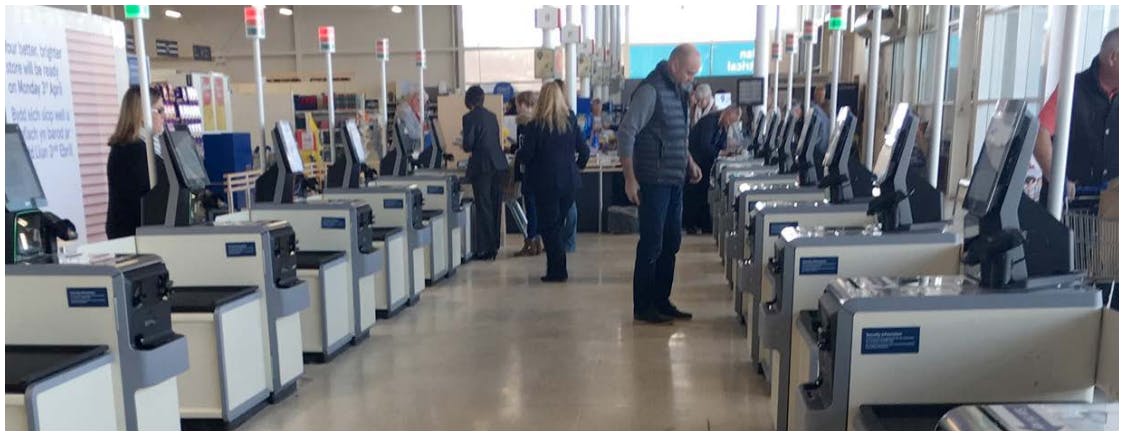
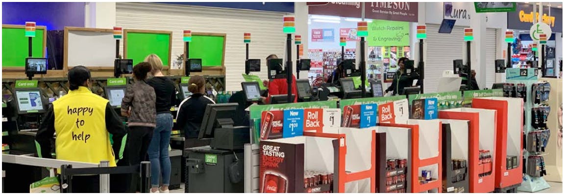
In this unique applied research study, academics and designers partnered with four of ECR’s Retailer members to immerse themselves in the self-checkout experience, understanding from the perspectives of the shopper and self-checkout supervisors, their journey from entry to exit, and their design challenges and frustrations. Whilst some Retailers have taken strong design approaches, the design-research nevertheless found SCO machines ‘plonked’ wherever they can reasonably fit, and shoppers not always sure how to use the machines or smoothly navigate the SCO environment. In response to this problem context, the design researchers adopted a human-centred design-led approach and formulated key insights to reframe the challenges at self-checkout. Then generated a range of concepts, most of which amount to sketches of possible incremental design changes that might help reduce retail losses and improve customer and staff experiences.
Research findings overall suggest that there are no silver bullet design solutions for the complex challenges faced at SCO and instead an ecosystem of low-tech and high-tech design solutions will have a role to play in reducing customer frustrations and improving flow at self-checkout. While improved machine solutions (including future capacity for AI computer vision technology) can address some existing challenges, the key takeaway from this report is to show how refreshed “design thinking” approaches and small design interventions can make a big difference. The report highlights simple design methods that can be adopted and low-tech concepts that can be adapted and tested by Retail partners to improve upon a range of local problems, suggesting improvements that take a human-centred focus. It urges Retailers to engage with design thinking to better understand design context at SCO to help improve customer experience and reduce retail losses.
Abstract
In this unique applied research study, academics and designers partnered with four of ECR’s Retailer members to immerse themselves in the self-checkout experience, understanding from the perspectives of the shopper and self-checkout supervisors, their journey from entry to exit, and their design challenges and frustrations. Whilst some Retailers have taken strong design approaches, the design-research nevertheless found SCO machines ‘plonked’ wherever they can reasonably fit, and shoppers not always sure how to use the machines or smoothly navigate the SCO environment. In response to this problem context, the design researchers adopted a human-centred design-led approach and formulated key insights to reframe the challenges at self-checkout. Then generated a range of concepts, most of which amount to sketches of possible incremental design changes that might help reduce retail losses and improve customer and staff experiences.
Research findings overall suggest that there are no silver bullet design solutions for the complex challenges faced at SCO and instead an ecosystem of low-tech and high-tech design solutions will have a role to play in reducing customer frustrations and improving flow at self-checkout. While improved machine solutions (including future capacity for AI computer vision technology) can address some existing challenges, the key takeaway from this report is to show how refreshed “design thinking” approaches and small design interventions can make a big difference. The report highlights simple design methods that can be adopted and low-tech concepts that can be adapted and tested by Retail partners to improve upon a range of local problems, suggesting improvements that take a human-centred focus. It urges Retailers to engage with design thinking to better understand design context at SCO to help improve customer experience and reduce retail losses.
Foreword
The ECR Retail Loss Group is delighted to have had the opportunity to work with the University of the Arts London, Design Against Crime Research Centre under the leadership of Professor Lorraine Gamman in support of this innovative study on the potential role of new design thinking in managing the use, misuse and abuse of selfcheckouts.
As our previous studies have highlighted, self-checkouts present retail stores with opportunities, problems and challenges.
In this unique study, academics and designers partnered with four of our retailer members to immerse themselves in the self-checkout experience, understanding from the perspectives of the shopper and self-checkout supervisors, their journey from entry to exit, and the de-sign challenges and frustrations.
Two reports have been generated for this project: this ‘short’ report presents research insights and twenty design concepts, each responding to specific problems revealed through the process. The second and ‘full’ report includes this content containing the aforementioned content in addition to a comprehensive account of DAC’s design-led approach, methodology and crime science thinking. We encourage you to review each of these in your business, with as many functions as possible, including those on the shop floor and in the critical role of the self-checkout supervisor.
Most of all, we encourage you to consider the three recommendations from the researchers. First, given the design issues the researchers uncovered, organisations should consider a survey of self-checkout hosts, to listen to their ideas on what is working and what is not working at the self-checkouts. Secondly, organisations could encourage their top managers from across the different functions, to immerse themselves in the self-checkout experience and journey, mapping the journey of the shopper, documenting the failure points and to co-create new design approaches to improve participation, the customer experience and increase accuracy. Finally, the researchers recommended that retailer organisations consider adding a seat at the table for a designer, to help oversee the expansion of self-checkouts.
Above all, I very much hope you enjoy reading this report and utilising its findings to better understand how design might be impacting upon your objectives to improve the shopping experience through selfcheckouts while minimising loss.
Finally, I would like to thank all those companies that agreed to support this study – your contribution to helping the broader retail community better understand this important issue is very much appreciated.
John Fonteijn
Chair of the ECR Retail Loss Group
Executive Summary
Design Thinking for Retail
This study seeks to promote a positive customer experience at SCO as well as the reduction of retail losses through better use of design and “design thinking”1. As part of a short design sprint, our design team visited multiple retail locations, observed shoppers and shadowed SCO hosts in different stores. Taking a human-centered design-led approach, we formulated insights from the research, reframed the challenges at SCO and responded with a range of concepts most of which amount to incremental design changes that might help reduce retail losses and improve customer and staff experiences. Whilst some Retailers have implemented design processes, we nevertheless found SCO machines ‘plonked’ wherever they can reasonably fit, and shoppers not always sure how to use the machines or smoothly navigate the SCO environment. This is part of problem landscape where small design interventions can make a big difference, and refreshed design approaches can help.
This report synthesizes our research findings and design thinking in response to insights gathered from Retailers, hosts and shoppers. It suggests that improved machine solutions (including capacity for AI computer vision) can play a role but are not the singular remedy for complex challenges. Astute assessment of layout, signage and digital communication design at existing SCO machines as well as listening to staff about insufficient and/or clumsy store responses to customer problems, may help better understand the real barriers to success. Also, what to improve, by design.
Our findings about what sort of design adjustments could be made in SCO scenarios are presented in two reports: this ‘short report’ containing just the research insights and design concepts, and a full report, which can be found online2, containing the aforementioned content in addition to a comprehensive account of DAC’s design-led approach, methodology and crime science thinking by criminologist Prof. Paul Ekblom (for those who wish to apply design against crime ideas in practice).
Both reports seek to highlight simple methods and low-tech ideas that can be adopted to improve upon a range of local problems, suggesting improvements that take a human-centered focus and ask Retailers to engage with design thinking to better understand design context.
We recognise some Retailers already employ design teams and are very familiar with design thinking. Also, that your organisations have invested heavily in top-down design refurbishment and rebranding of selfcheckout. What this report advocates is how to refresh bottom-up design understandings that your staff and customers know are needed on the shop floor. Paying constant attention to self-checkout environments and regularly making design tweaks rather than waiting for new machines or a massive design overhaul is what we see is possible. To repeat, small incremental design changes at SCO, even retrofits, can make a difference and a strong contribution to staff, customers and your business.
Given there is no one design layout or SCO machine that will work as a fail-safe prescription for all stores, we offer not just design responses but an account of our design process, which incorporates human centered and service design methodologies to help you create useful design responses to address your specific needs.
Design Responses
Below are just two examples (see further designs and more detail on pages 10-21) of design responses to SCO challenges our team generated for the stores they visited which we hope will inspire you to read further:
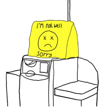
Ill Till Cover
A playful material cover to clearly indicate when an SCO till is out of order. By using a larger, visual cue, shoppers can see which tills are out of order from a distance, rather than waiting until they approach the screen. This can be indicated in various ways, and can adapt store design colours, but we recommend using physical objects as opposed to digital signage which can often produce visual clutter this is easily ignored by shoppers.
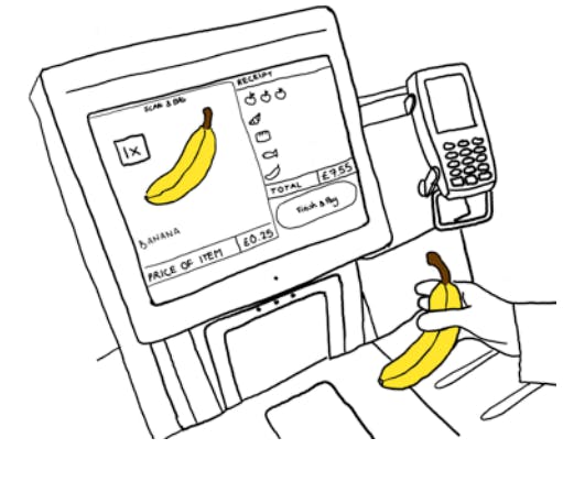
Using Icons
Using large visual icons, instead of words, to improve the customer interface for users as well as hosts, who can now see the screens from farther away, can improve SCO. By showing each item scanned, staff can check whether mis-scans have occurred by matching the icon on screen to the scanned item. Shoppers will be able to check that they have scanned and bagged the correct item while deterring theft through publicising the item being scanned. There may be scope for linking this data with camera-based product detection technology.
The “Design Thinking” that generated the above design solutions to problems encountered at SCO has a role to play as some Retailers already know, but there is room for more, and now is a good time to invest in these practices. Design thinking can be introduced to your organization by employing design experts on short sprints, or even design graduates as residents regularly working on the shop floor to help you engage with your staff to figure out changes appropriate for your context. Our easy to try methods documented in this report can also help you understand why design can respond appropriately to almost all local challenges, in effect helping you ‘control the SCO environment dynamically’ (Beck, 2018)3. Underlying issues may be linked to ‘design fatigue’, a term used colloquially by DAC but has also been expressed in different terms by Beck.
‘Design fatigue’ is the all too frequent moment when customers become so annoyed with automated service, they simply choose to act in defiance of store by petty theft and/or walking out of the store (in the worst cases walking away with unpaid goods or insulting staff). Hurried confused and frustrated customers sometimes justify obtaining goods without (sufficient) payment whether accidentally or intentionally. At the other extreme are what Emmeline Taylor (2016) calls ‘SWIPERS’4: those ‘seemingly well-intentioned patrons engaging in routine shoplifting’. Design adjustments can quickly make things easier to reduce customer frustrations and find canny ways to deter scheming thieves, that are part of but not exclusive to the following description of categories such as:
Non-scanning: sometimes referred to as Scan Avoidance, this can be carried out in several ways at Fixed SCO machines:
- Passing items across the scan area ensuring the barcode cannot be read.
- Passing items around a scan area
- Stacking items to obscure barcodes.
- Leaving items in a basket or trolley.
Mis-scanning: there are a number of ways that mis-scanning occurs, most are in the favour of the shopper, however double scanning can benefit the retailer if not detected. The list below captures five forms of misscanning at Fixed SCO:
- Product Switching: this is occurs through product misrepresentation, where a user places a particular item on a weigh scale, such as a kilo of grapes or a bottle of wine, and then chooses a cheaper item from a list of options available, such as carrots or potatoes.
- Barcode Switching: this occurs where a user obtains a different (usually cheaper priced) barcode and scans it as a more expensive product is moved across a Fixed SCO scan area. Alternatively, a user can utilise a cheaper barcode on another product to scan an item, particularly where they look and/or weigh the same, such as bottles of wine.
- Multi-variety Errors: this occurs where a user has selected a product which is available in a number of varieties or flavours, such as a tins of cat food – chicken, beef, fish etc. The consumer simply scans the same variety several times to speed up the process and then places all the items in the bagging area. While there is generally no immediate financial loss for the retailer, the inventory system will now incorrectly assume it has sold more/less of any given SKU.
- Promotion Errors: this relates to programmes such as Buy One Get One Free (BOGOF) where the user scans only one item (assuming the ‘free’ item does not need to be scanned). While there is generally no immediate financial loss for the retailer, the inventory system will now incorrectly assume it has sold less of any given SKU.
- Double Scanning: this occurs when a consumer accidentally scans and then subsequently pays for the same item more than once. This can lead to overpayment by the consumer and the corruption of store inventory records.
Walk-aways: this form of loss occurs at Fixed SCO machines when a user has scanned some or all of their items correctly and triggers the completion of transaction process but does not make payment, simply walking away with the items. A variant of this form of loss is where the user scans all their items and triggers payment by card but does not enter the card correctly in the card reader and/or enters the wrong pin number. For some systems this will generate a payment error/declined print-out which, to the casual observer, may be misconstrued as a valid receipt. They then walk away leaving the transaction uncompleted.
Recommendations
Whilst there are no silver bullet design solutions for addressing SCO losses and mitigating friction in the retail environment, there is much that store staff and design professionals can do to make a difference. Our design responses and recommendations (pages 20-28) will not offer solutions for every store nor will they remedy all possible SCO challenges, but they can work alongside other advancements like AI computer vision and vision-based security at SCO. We hope that our design-led approach and methods of how we generated potential remedies will be of value to all organisations. Our view is those stores already preparing for more widespread introduction of SCO machines, or mobile self-scanning technologies, should understand context to better manage design of visual communication, layout and flow in pragmatic and consistent ways. This is why we urge readers of our report/s to learn some simple lessons and use our methodologies in order to fully comprehend what is meant by a design-led approach.
We hope that what follows will help broaden your understanding about how to better use design for SCO, to absorb staff know-how and meet the needs of your customers in user-friendly ways. Also, to thwart evolving forms of theft with agile physical and digital design responses that can work to design out crime in ever-changing times.
Introduction
Research Objectives & Design Brief
Research Objectives
The objectives of the research were to understand how we might:
- Improve SCO Participation – Encourage more customers to use SCO.
- Improve Customer Experience – Reduce friction, frustrations and walkaways.
- Improve Scan Accuracy – Reduce mis-scan, non-scans and other forms of misuse and abuse that contribute to retail loss.
The design team approached these challenges through immersive research in the supermarkets with the help and facilitation of our Retailer partners. Our research uncovered insights which led to design concepts that we present pragmatically in this report. Above all, our aim is to help Retailers adopt a human-centered approach and easy-to-use design methodology when investigating future challenges, so as to better develop and implement new design proposals.
Design Brief
SCO is here to stay and likely to expand across stores globally. ECR asked the Design Against Crime Research Centre how we might better listen to store staff and customers to find out what problems and frustrations exist at SCO, and whether or not design could help resolve some of these problems. More to the point, how might we use cost-effective design communication, store and SCO layout, as well as service design to improve customer experience at self-checkout? What could we do to ensure that different stores could utilize our ideas and adapt designs for their own unique problem contexts? Apparent customer confusion at machines often appears to correlate with misuse and abuse (theft). Could we design out some crime opportunities and customer frustrations ensuring positive customer experience is not compromised by overdetermined security?
Design Methodology
The Double Diamond Framework
On this project, four retailers allowed DAC researchers the opportunity to shadow and interview their staff whilst observing customers and other interactions and create case studies. Following this research and a subsequent period of design development, we were able to present our findings at the ECR Self-Checkout Innovation Conference. Experts representing the loss prevention, customer service and technology functions from 30-plus Retailers provided feedback on the design concepts, and their insights contribute to the newest iterations of design concepts provided in this report.
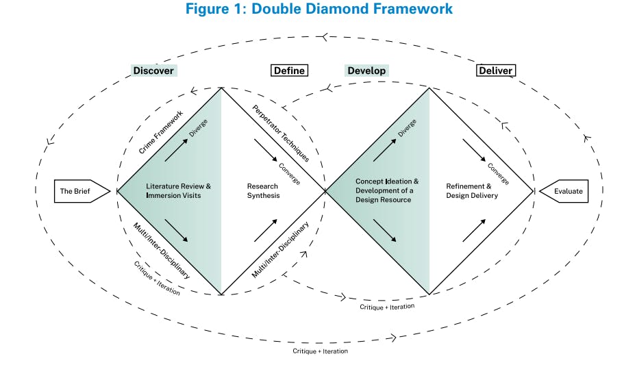
Design Against Crime’s (DAC) design process is visualised in the Double Diamond1 framework (Figure 1), an iterative 4 stage process that cycles through phases of exploration and synthesis.
Stage 1. Discover: Research to uncover insights and expand contextual knowledge. In this stage the designers immersed themselves in the retail environment, interviewing and shadowing retailers in order to identify existing and state-of-the-art SCO products, services and layouts, to identify points of friction in the SCO experience for hosts and shoppers, and to understand latent needs and desires of hosts and shoppers.
Stage 2. Define: Synthesise the research findings into frameworks that elucidate the key challenges and make it easier to identify opportunities for design interventions.
Stage 3. Develop: Come up with any number of potential design responses to the challenges identified.
Stage 4. Deliver: Refine the design responses and recommendations into a range of workable solutions that contribute to a design resource of appropriate responses.
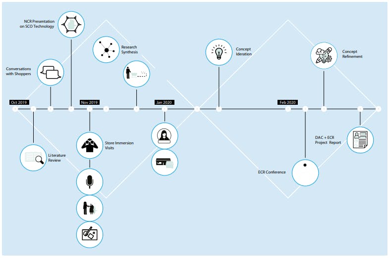
Timeline of Activities
This visualisation provides a general overview of the 22-week project timeline and the design research activities conducted by DAC in relation to the Double Diamond framework.
Key Insights
Noticing Patterns and Developing Key Findings
Immersive store visits with the participating retailers, provided the design team with a wealth of information. Data collected included observations, quotes from interviewees, artefacts from collaborative sessions, pictures and audio recordings. In order to use this data in a meaningful and systematic way, we developed key insights from clusters of observations. Key insights help to communicate the most important findings from the research. These insights are not simply one-off observations; rather, they are formed from a series of such observations and represent many people’s needs and desires. These insights become the basis for ideation: helping to develop ideas, concepts and prototypes that are based on real data.
Key Insights
Frustrations
- Disorderly queues, congestion in the SCO area and friction at self-checkout contribute to an unpleasant and chaotic experience for hosts and shoppers. These frustrations affect customers’ actions when they use SCO, manifesting in mistreatment of staff and other shoppers, and contributing to mis-scans, non-scans and walkaways.
- Inconvenient and inefficient SCO procedures annoy shoppers and are used as justification to act in ways that contribute to retail losses.
Scanning Issues
- Hosts and shoppers have issues with the usability and legibility of SCO interfaces.
- Hosts find it difficult to manage their SCO area and provide customer service and surveillance when there is extensive multitasking and incorrect staff to SCO ratios especially for long periods of time.
- SCO layout greatly affects hosts’ ability to manage the checkout area.
Payment Verification
- It’s not obvious to shoppers or hosts when the contactless transaction is complete.
- Shoppers frequently struggle to navigate to the correct till for their desired payment type, notice signage and comprehend written information around them.
Communication
- There are frequent breakdowns in communication between shoppers and hosts.
- Systems in place for hosts to report to management are slow and not easy to use. This creates apathy and fatigue towards these procedures.
- Daily issues encourage ad-hoc solutions such as bespoke signage, however it often results in obtrusive designs which highlight lack of consideration and consistency of design language.
Personas
- Diverse shoppers have diverse needs, which must be acknowledged and addressed across the SCO process.
11 Key Insights: Frustrations
The following insights deal with the notion of frustration – amongst both shoppers and hosts – illustrating how emotions can overwhelm, and how annoyance and confusion contribute to loss and negative experiences at SCO.
1 – Frustration - Bad Experience
Disorderly queues, congested SCO areas and other unpleasant and chaotic experiences affect hosts and shoppers. For customers, it can manifest in mistreatment of staff and other shoppers, and contribute to mis-scans, non-scans and walkaways.
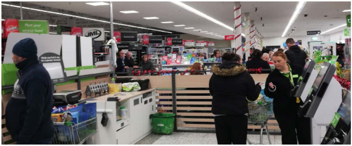
Overcrowding creates blind spots for hosts in the self-checkout space. Congestion may occur as a result of broken-down tills creating longer queues; trolleys being mis-directed into the SCO area; selfscan shoppers who have many items overwhelming SCO tills, or inadequate barriers delineating where queues should line up, to name a few.
Evidence
Many shoppers go directly to the first till, then notice it is out of order. By the time they notice this, the next shopper in line is already at the next free till, so they end up awkwardly standing in the middle of the SCO area, perplexed.
Observed at multiple retail locations.
At one store, the queue expands into two lines, for cash and card. At the start of the queue, there is no indication this will happen. However, shoppers who know this will cut through the queue, making other shoppers angry.
Observed in store.
After wait times surpassed estimated wait minutes posted at the start of the queue, one shopper began to read a magazine while they waited, another shopper swore to voice their frustration.
Observed in store.
The queue pushes into the SCO area, because there is no barrier at the front of the queue. This creates congestion and disorder and causes problems for the hosts.
Observed at multiple retail locations.
2 – Frustration - Hard to Use SCO
Inconvenient and inefficient SCO procedures annoy shoppers and are used as justification to act in ways that contribute to retail losses.
Customers will use SCO for its perceived speed and efficiency. To avoid inefficiencies that might require assistance or will cause a delay, shoppers might knowingly act in ways that, for all intents and purposes, constitute theft. For example, selecting a random bakery product at checkout if they can’t recall the exact name of their bread. Shoppers will justify these offences by reasoning that the possible price discrepancy is not significant, or that the SCO system is needlessly difficult.
Evidence
There have been difficulties with students who only have cash using the wrong lane and being redirected. This can be a reason for stealing or even used as an excuse to justify stealing.
Interview with staff.
“I guess sometimes I do end up accidentally ‘stealing’. I often won’t know what type of loose apple I have for instance. I’m not going to go back and check, so I’ll just pick the cheapest one.”
Interview with a shopper.
“It happens a lot (accidentally not paying for something). Sometimes you have to keep everything on that small SCO desk thing, and sometimes you just don’t see something, like a chocolate bar. It’s never massive, but little items are easy to forget about.”
Interview with a shopper.
The SCO area is shared with Scan & Go. Shoppers using SCO are not usually allowed more than 15 items, but shoppers using Scan & Go can fill up their cart with many items, and use the same till, causing congestion.
Observed in store.
11 Key Insights: Scanning Issues
The following insights are built around issues with scanning at self-checkout. These insights illustrate common problems encountered by hosts and shoppers, which prohibit effective scanning at selfcheckout, thereby contributing to loss and tension.
3 – Scanning Issues - Hard to Use
Hosts and shoppers have issues with the usability and legibility of SCO interfaces.
Shoppers note frequent hesitations and issues with the self-checkout interface, with certain demographics often requiring much more help than others. In addition, hosts struggle to view the screens from afar and report usability issues with lighting systems. The SCO interface needs to be adapted to support use by all demographics, and for both shoppers and hosts as key users.
Evidence
“When the light above the scan is red, then they think the till is closed, and hosts are asked if it’s open. The light system is too ambiguous. Customers don’t know what each colour means.”
Interview with staff.
During an interview, we learn that, in order for a host to confirm that the avocado a shopper is swiping is, in fact, tagged as an avocado, the host must read the list on the shopper’s screen which can be difficult when further away.
Interview with staff.
During an interview, we learn that, in order for a host to confirm that the avocado a shopper is swiping is, in fact, tagged as an avocado, the host must read the list on the shopper’s screen which can be difficult when further away.
Interview with staff.
4 – Scanning Issues - Slow Host Response
Hosts find it difficult to manage their SCO area and provide customer service and surveillance when there is extensive multitasking and incorrect staff to SCO ratios especially for long periods of time.
Hosts are more efficient when there are fewer things to focus on, especially non-essential tasks. In order to cope with stimulus overload, hosts filter things out and only focus on high alert actions. Hosts are in need of better support in order to multitask effectively, and also require adequate time to mentally recharge.
Evidence
“If you help one person, you can’t see them all. When you have 10 customers, it’s impossible to check on all of them.”
Interview with staff.
In reference to the traffic light system, a host describes how it actually hinders their awareness of what’s happening and instead they prefer to simply watch the shoppers with their own eyes.
Interview with staff.
During one interview, a host explains to us that they don’t believe iPads or ‘extra screens’ would be used much by hosts.
“There is too much to focus on already, it’s easier to just look up at the shoppers.”
Interview with staff.
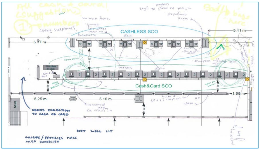
5 – Scanning Issues - Bad Layout
SCO layout greatly affects hosts’ ability to manage the checkout area.
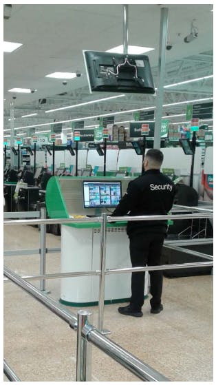
The positioning of hosts along with the size and shape of the corral, greatly affects hosts’ ability to observe in the SCO area. On the whole, hosts need to be able to see the entire SCO area from a single location or must otherwise be supported by additional staff, surveillance and security systems, or alternative layouts.
[image] [below] Example of how the design team and Retail staff visualised what works and what doesn’t in the SCO area. Here we marked up a diagram of the SCO layout for the store we visited. This was one of several different layout-based activities that provided context specific insights.
Evidence
“If there were two separate sections, we could each man our own and manage visibility better, [rather than have two hosts in one large section].”
Interview with staff.
During one interview a host explains to us that they actually struggle to monitor shoppers more when there is too much space between tills. The extra space creates a larger area for their eyes to scan.
Interview with staff.
“We don’t need more staff, we just need to be positioned differently.”
This idea was echoed by hosts on a number of immersion visits.
Interviews with staff.
11 Key Insights: Payment Verification
The following insights illustrate issues with the payment verification at SCO. The central problem was the distinction between card and cash payments; subsidiary issues include identifying who has or has not completed a successful transaction.
6 – Payment Verification - Contactless
It’s not obvious to shoppers or hosts when the contactless transaction is complete.
At the moment, it’s difficult for shoppers and hosts alike to confirm that a transaction is complete. This causes problems for shoppers who are trying to be honest as well as shoppers abusing the system. In addition, hosts struggle to differentiate shoppers who have paid successfully from those who have encountered an error or not paid at all. This is an issue specifically to do with contactless payment where a receipt is not desired.
Evidence
“When people walk away without paying, on purpose or accidentally, it’s difficult to identify the person. The hosts may not remember exactly which one was at their till.”
Interview with staff.
“Especially on small purchases, the customer will walk away from a ‘mis-tap’ because they don’t need a receipt.”
Interview with staff.
“The issue is that people aren’t held at the SCO until payment has been confirmed, and they simply tap and leave. When this happens, staff can’t do anything because the shopper has already walked away and is either too far away or difficult to identify.”
Interview with staff.
7 – Payment Verification - Cash Vs Card
Shoppers frequently struggle to navigate to the correct till for their desired payment type, notice signage and comprehend written information around them.
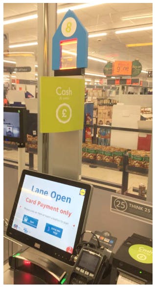
Navigation problems can account for the majority of issues in the self-checkout space. Shoppers often wait for hosts to tell them which till to use, occupying the host’s time. Or they approach tills which are out of order or fail to realise that they are using a card-only SCO when they intend to pay with cash.
Evidence
“Cash vs. card lines cause aborts, which frustrate the shopper, creates more work for the hosts and creates an opportunity for theft.”
Interview with staff.
Customers in the queue wait for selfcheckout hosts to direct them to an open till. This happens both during busy and quiet periods. Hosts use voice and gestures to direct customers in the queue.
In-store observations.
“No one reads the signs, they don’t realise there’s a difference [between cash vs. card only tills] until they’ve [scanned] their whole shop.”
Interview with staff.
A shopper describes the overcrowding of signage at the shop, making the signs almost useless. “There’s too much information,” they say.
Interview with a shopper.
11 Key Insights: Communication
The following insights stem from issues of communication, between hosts and shoppers, across teams at a store-level and between stores and headquarters. Many of these issues call for the need to re-focus and re-shape processes from a human-centered approach.
8 – Communication - Host & Shopper Breakdown
There are frequent breakdowns in communication between shoppers and hosts.
Shoppers need more transparent reassurance – that help is on the way or a host will be nearby if an issue should arise. Additionally, hosts are often subjected to disrespectful behaviour and targeted for any problems that occur during a shopper’s journey. With SCO, we’re seeing less interaction between hosts and shoppers, but we still need to encourage healthy communication, respect and support.
Evidence
In many cases, we observe hosts awkwardly peering over shoppers’ shoulders or keeping their eyes on them like a hawk.
Observed at multiple retail locations.
From interviews and observation, we learn that host uniforms which are indistinct in colour (like grey or navy) make them difficult for shoppers to spot.
From interviews and observations.
A host describes receiving “a lot of verbal abuse” from shoppers, explaining how she gets blamed when machines don’t work or if queues are too long. She’s acting “on the defense.”
Interview with staff.
“The thing is, I hate self-checkout. They don’t work properly. The software and hardware are awful. When a customer has an issue they assume it’s my fault, when actually I’m as annoyed as they are at the system.”
Interview with staff.
9 – Communication - Poor Feedback Loops
Systems in place for hosts to report to management are slow and not easy to use. This creates apathy and fatigue towards these procedures.
Currently, communication between headquarters and SCO hosts is difficult, not engaging or not happening at all. In order to implement effective methods and new technology in stores, headquarters needs appropriate methods for feeding information to hosts. In addition, hosts have valuable knowledge of frequent issues, success stories, and reviews of new products, but lack adequate ways of sharing their know-how company-wide.
Evidence
As an example, we observed the traffic light system. This was implemented to improve interactions and efficiency, however, if many hosts aren’t using them this needs to be discussed and improved.
From interviews and observations at multiple retail locations.
“I could send out a newsletter, but who is going to read a list of a hundred detailed items?”
Interview with staff.
Staff create ad-hoc solutions to issues, such as creating a box for receipts or placing something on top of a till to show customers it is out of order. These solutions are only shared within individual stores, not across the company.
Interviews with staff.
10 – Communication - Untidy Spaces
Daily issues encourage ad-hoc solutions such as bespoke signage, however it often results in obtrusive designs which highlight lack of consideration and consistency of design language.
Currently, if a store manager or host recognises a need for a service or layout change, they will often take matters into their own hands, employing impromptu solutions. By engaging a design thinking perspective, Retailers can develop more considered, better designed solutions which help to solve common issues without feeling like they are an after-thought, and developing a consistent and recognisable design language.
Evidence
Queues often get out of hand, and because there is no obvious queue position, the hosts use a rope to signify where shoppers should line up. A staff member from headquarters, explains that this isn’t protocol, “They have thought this up themselves.”
From observations at Retailer A.
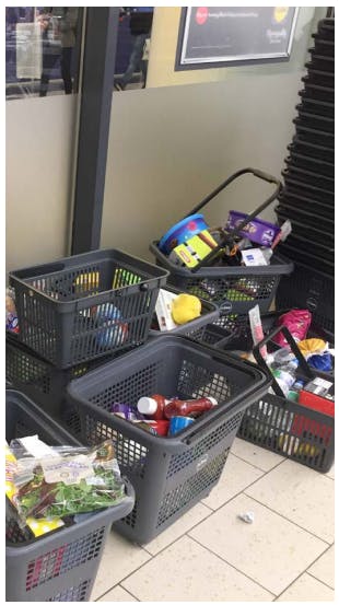
At various retail locations, we observed clutter (piled up trolleys) or wasted space (fridge doors blocked) as a result of issues being addressed in an ad-hoc, per issue manner.
From observations at multiple retail locations.
During peak hours in stores, impromptu props include neon cards and bottomup baskets to signify broken down tills. The effectiveness of these props is often questioned by the staff themselves.
From observations at multiple retail locations.
11 Key Insights: Personas
The following insight helps us understand SCO as an experience. It’s important to keep in mind the variety of people who interact with SCO, and how needs differ or change over time.
11 – Personas
Diverse shoppers have diverse needs, which must be acknowledged and addressed across the SCO process.
Retailers may gain value from better understanding the various types of shoppers who engage with selfcheckout. Especially as the use of SCO increases across stores, shoppers of diverse demographics will need to be taken into account for when designing SCO spaces, services, products and host training. In design, the use of ‘personas,’ or characters who are created through clustering user experiences into various ‘types’ of users, helps to bring users to the forefront of design decisions. This practice could be implemented across Retailers to shape a more human-centered SCO process.
Evidence
“I find that older people are [more open to learning] than others. They want to learn in spite of their age and then, they realize that it’s not that difficult after all. The only fear they have is forgetting an item.”
From an interview with a host at Retailer B.
“Students and young people who [only] have cash ... use the wrong lane and then have to be redirected.”
From an interview with a host at Retailer B.
During visits to various retail locations and in client meetings, we learned that while hosts have a general idea of ‘types of shoppers’, however, there isn’t yet a process for designing for, or training for, these common interactions.
From multiple observations and interviews.
20 Design Concepts
The 20 design concepts featured in this report are the top design concepts according to the Retailers’ feedback at the ECR Self-Checkout Innovation Conference (Feb 2020).
These concepts have been grouped into three areas of benefit that describe how the designs can:
- Improve SCO Participation – Encourage more customers to use SCO.
- Improve Scan Accuracy – Reduce mis-scan, non-scans and other forms of misuse and abuse that contribute to retail loss.
- Improve Customer Experience – Reduce friction, frustrations and walkaways.
Improve Participation
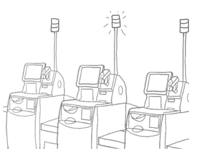
Ill Till Cover
A playful cover to clearly indicate when an SCO till is out of order. By using a larger, visual but gentle cue, shoppers can see which tills are out of order from distance, rather than waiting until they approach the screen. This can be indicated in various ways. We strongly recommend using physical objects (such as a textile cover) as opposed to digital signage as this is easily ignored by shoppers.
Improves Upon
Navigation
- Helps shoppers choose a working till from afar.
Efficiency
- Reduces frustration by improving efficiency.
- Reduces number of tasks for hosts.
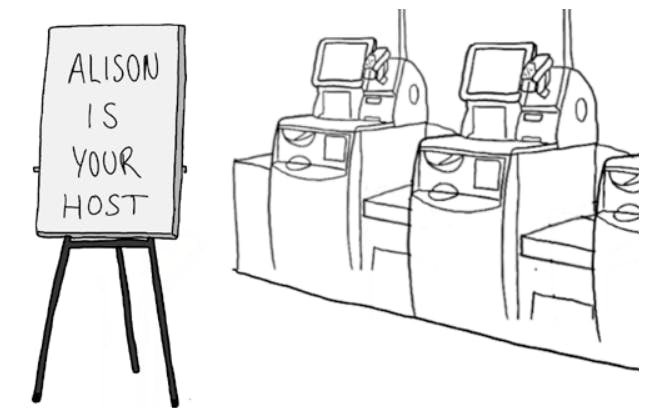
Host of the Day Board
A sign informing shoppers of their host’s name on a given day, encourages more personal host-shopper interactions while diffusing tension in the SCO space. In addition, this tool may provide hosts with a greater sense of ownership, empowering hosts to act with integrity and pride. This sign could be simply hand-written on a template or alternatively digitised, in order to handle shift changes more efficiently.
Improves Upon
Communication
- Decreases tension by humanising the host intervention experience.
- Increases host’s ownership of the SCO area
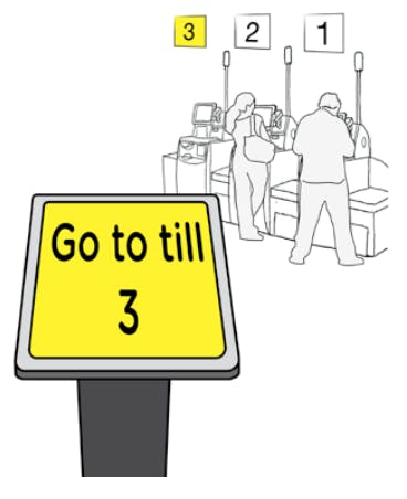
Next Open Till
This automated sign could be displayed at the front of a queue, directing shoppers to the next available till, in order to improve customer flow at SCO. This sign would also reduce the number of tasks performed by hosts, providing organisation and autonomy to shoppers in the queue. In addition, this display would provide a natural and clear delineation between the front of the queue and SCO area, reducing spillover and overcrowding in the space.
Improves Upon
Communication
- Signals a call to action for shoppers and members of the community.
- Establishes a culture of honesty, security and support.
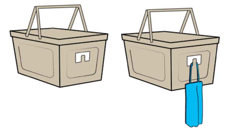
Shopping Bag Holder
As customers shop, their personal shopping bags can get buried underneath their items. This basket hook makes it easier for shoppers to access their bag as they begin their checkout process. While helping to improve efficiency for the shopper, this product also supports the entire SCO area by ensuring things run smoothly, queues stay short, and there are fewer distractions for busy hosts. Existing baskets and trolleys can be adapted or fitted to include a bag holder, rather than creating completely new baskets and trolleys.
Improves Upon
Usability
- Improves organisation at the till.
Efficiency
- Improves the speed and organisation of the checkout process.
Improve Scan Accuracy
Using Icons
Using large visual icons, instead of words, to improve the customer interface for users as well as hosts, who can now see the screens from farther away. By showing each item scanned, staff can check whether mis-scans have occurred through matching the icon on screen to the item in a customer’s hand. Shoppers will be able to check that they have scanned and bagged the correct item while deterring theft through publicising the item being scanned. There may be scope for linking this data with camera-based product detection technology
Improves Upon
Usability
- Easier for shoppers to know what’s been scanned.
Communication
- Increases surveillance as hosts can monitor interfaces from afar.
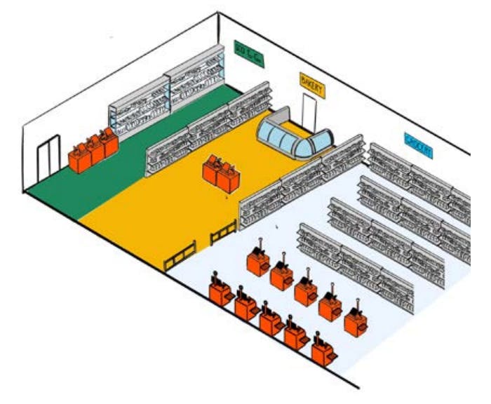
SCO To-Go
This layout aims to redirect congestion by compartmentalising the shop, with certain sections containing their own SCO area. One section of a shop may be catered towards quick bites and onthe-go purchases. Another section may carry items which require special assistance due to barcoding, such as bakery goods, loose fruits and vegetables, and bulk sections with nuts, grains and cereals – with emphasis on items which are commonly subject to theft. Concentrating “problems items” would improve efficiency for shoppers and support better monitoring by hosts.
Improves Upon
Efficiency
- Improves speed at which shoppers navigate the shop looking for snacks of take-away items
- Reduces queue times as shoppers with small baskets aren’t waiting behind those with large baskets.
- Improves processes in other parts of the shop.
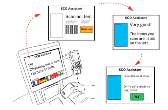
Digital Assistant
Many shoppers regularly require or seek assistance during self-checkout and these encounters keep hosts from effectively assisting other shoppers or managing the checkout area. This simplified self-checkout interface helps to reduce ‘noise’ and confusion caused by non-essential elements on the screen and the step-by-step instruction helps technology-timid or inexperienced shoppers to easily navigate the process. This mode would be optional, but nevertheless usable to all demographics, meaning children could participate in self-checkout at well.
Improves Upon
Usability
- Emphasises key features of the interface and a step-by-step guide to assist throughout checkout.
Efficiency
- Reduces confusion and need for host assistance.
Waiting Game
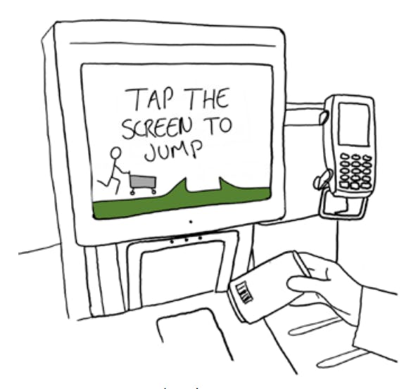
While waiting for assistance during checkout, shoppers could be prompted to play an optional, simple game on the SCO interface. This creates an opportunity for retailers to let customers know about special offers while engaging with shoppers while they wait. This would only be suggested as an option, as not all shoppers would want to engage with the game. It could be connected to random prizes or discounts.
Improves Upon
Communication
- Opportunity to engage with shoppers with a fun and exciting touchpoint.
- Reduces shopper frustration which results in improved experience with hosts and shop as a whole.
Assistance Flag
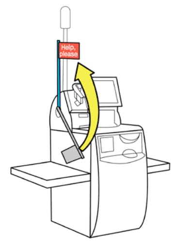
For shoppers who shy away from interaction with hosts, the use of a physical cue, like a flag, helps shoppers feel more comfortable seeking assistance. This feature mitigates tension between shoppers and hosts by providing a polite way for people to ask for help without feeling stupid, guilty, or awkward when calling the host over. At the same time, it provides shoppers with the reassurance that a host will come to assist.
Improves Upon
Communication
- Clear signalling improves communication between hosts and shoppers.
Efficiency
- Obvious visual cues help hosts assist shoppers quickly.
You’ll Be Helped Next
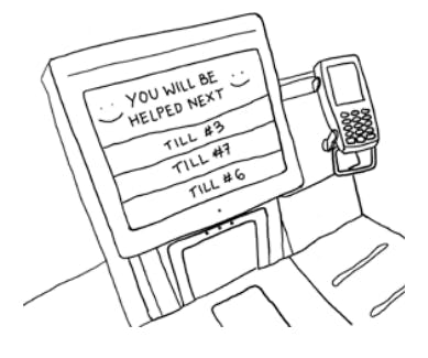
This digitised list indicates which shopper will be helped next. This feature aims to improve transparency and help defuse shopper frustration by providing clarity and assurance. Hosts could use a handheld device to monitor the list and move through in sequential order.
Improves Upon
Communication
- Brings a sense of transparency and fairness to waiting times and host interventions.
Smart Incident Reporting
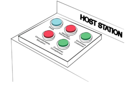
This tool for collecting quantitive and qualitative data can be used by SCO hosts during their shift on the floor. Gathering information about issues from hosts as they occur provides a more accurate indicator of SCO pain-points for management to assess and respond to efficiently. This feedback mechanism could be analog for ease of use, or it could be digital, for monitoring more involved metrics or flexible programming. As issues are logged often and accurately, management can use the information to develop solutions and mitigate problems that might bear an impact on retail losses.
Improves Upon
Communication
- Creates a method for tracking various metrics.
- Gives hosts agency to raise concerns or relay feedback.
Efficiency
- Improved the speed and accuracy at which issues are reported.
Basket Slot
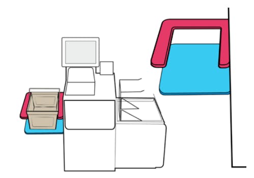
It is a common error for shoppers to begin their checkout by placing their basket or items on the scale before scanning. Adding slots onto the basket area of the till may help shoppers make a distinction between the basket area and bagging area or weighing table. This basket slot would use obvious physical affordances to indicate to the shopper how it should be used without the need for signage. As basket sizes vary across and within retailers, the slot would need to be flexible. The design of the slot could either be easily adjustable or customised for different types of tills and basket.
Improves Upon
Efficiency
- Reduces number of interventions caused by misplaced baskets.
Usability
- Doesn’t require additional signage around the till, as the shape of the basket slot indicates the correct side.
Gamify Random Checks
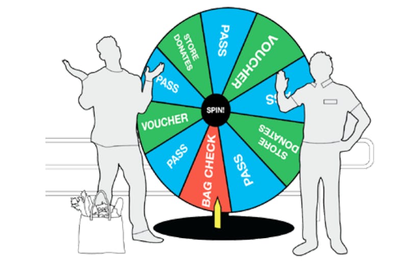
A gamified system could be used to conduct random checks in a transparent and honest manner, reassuring shoppers and staff they are not being targeted or profiled. Before leaving from work or after paying for their shopping, staff and shoppers, respectively, must play a quick game of chance to see if they need to get their bags checked or win a prize. This process is worth their while because they are given supermarket rewards when found “error free.” There are many possible ways to gamifying this process, such as, a roulette wheel or a slot machine. Analog systems add a level of transparency and honesty.
Improves Upon
Communication
- Gamifies process in order to make checks feel “random” and less targeted or based on demographics.
- Makes interventions less awkward as it is clearly understood as standard procedure and that there might be a reward from engaging.
Free Kids Toy
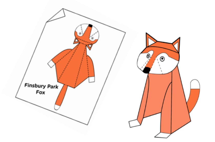
Children create a significant distraction in a shopper’s journey, both while selecting items and during the checkout process. This modest, free toy occupies children and, in turn, reduces the number of mistakes a shopper makes as a result of distraction. In addition, parents have been found stealing items for their children, such as toys, so this small gesture may motivate shoppers to refrain from stealing. Using low-cost, recyclable materials, making simple designs that are unique to a store’s location, would help maintain a level of novelty and brand identity.
Improves Upon
Communication
- Opportunity for stores to express a local identity.
- Possible to drive loyalty and draw in shoppers.
Efficiency
- Occupies children to reduce shopper distractions.
Reduce Walkaways
Temporary Receipt
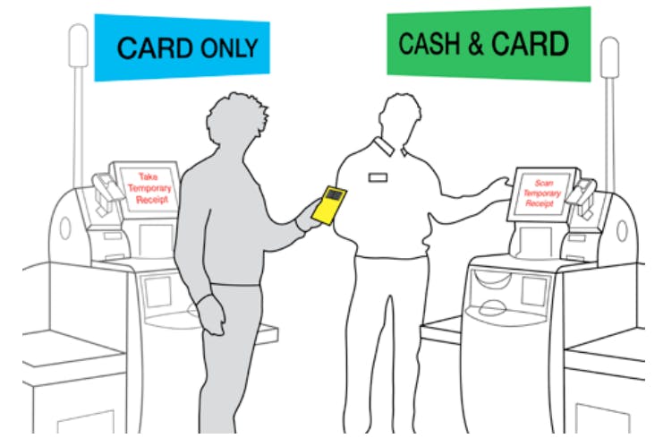
If a shopper checks out at a card-only till, only later realising they need to pay with cash, the host can print a temporary receipt which the shopper can take to another cash till and complete the transaction. The temporary receipt would need to be easily distinguishable from a payment receipt, in order to avoid potential honest or dishonest mistakes. This system would aim to reduce walkaways and allow for better tracking of aborts.
Improves Upon
Usability
- Streamlines transactions between different types of SCO.
Efficiency
- Reduces the need for a shopper to re-join the queue and begin the process over again.
Cash vs. Card Mats
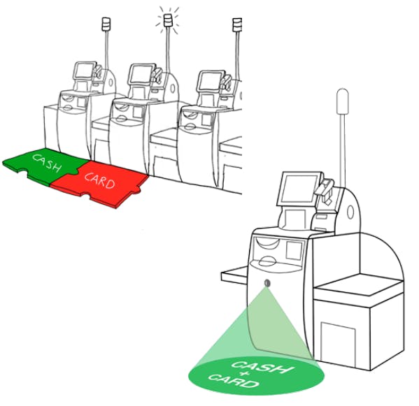
Mats on the floor can be used to clearly indicate which tills are card only in the SCO area. Signage on the walls or above tills is often ignored or goes unnoticed. By making use of the floor space, the information is more noticeable in an environment that often has an overabundance of signage at eyelevel. These mats could be made as vinyl stickers, foam pieces or digital projections onto floors. In order to adapt to changing conditions, mats could be double-sided and modular.
Improves Upon
Efficiency
- Improves queue times and customer flow in the area.
- Reduces the number of tasks for hosts.
Navigation
- Improves wayfinding as a shopper approaches a till.
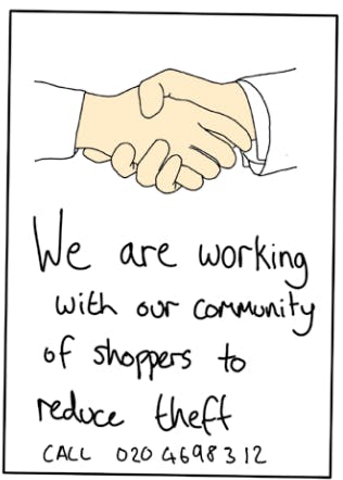
Neighbourhood Watch
Posters displayed in stores highlight that this is a community of shoppers who look out for strange behaviour; a number is available to call for anonymous help. These posters aim to appeal to peoples’ better judgement, showing how stealing negatively impacts a community. This stimulus impacts shoppers who may steal off the cuff, by instilling a sense of being watched and making the consequences of stealing more apparent. With this recommendation comes caution against overwhelming a store with these posters. An overabundance of such communication may be negative. It could make the environment seem more threatening than it actually is, and perhaps friendly eyes watching could be a theme to develop.
Improves Upon
Communication
- Signals a call to action for shoppers and members of the community.
- Establishes a culture of honesty, security and support.
Payment Assurance Light
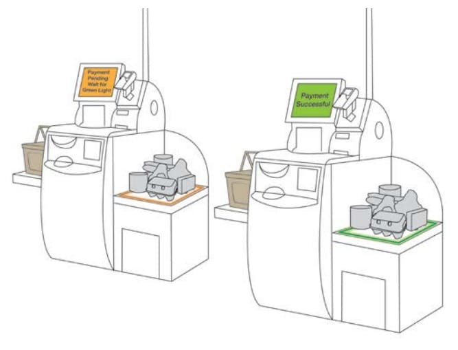
After scanning all their items, a shopper selects a payment method and orange light begins to blink on the bagging area. A message appears on the user’s screen, as well as a voice message stating, “Please don’t take your shopping until the light turns green”. After the payment authorised successfully, the light turns green and stops blinking, while a message states, “Thank you, you can now take your shopping. Goodbye.” This system can be integrated with existing SCO machines by using a spotlight which shines down on the bagging area.
Improves Upon
Communication
- Creates a clear signifier and provides an additional level of confirmation.
Usability
- Ensures shopper will not leave until payment is authorised.
Payment Tokens
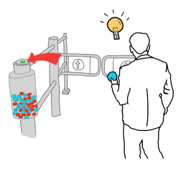
Currently, some stores require shoppers to scan barcodes on their receipts in order to pass through exit barriers. In some cases, this has proven to be a problematic process. With this option, reusable plastic tokens are dispensed from the till after checkout is complete, the shopper then uses these tokens to exit the checkout area. In addition to being used for exit, shoppers could have the option of placing their token in one of several ‘buckets’, each for a different charity or organisation that the retailer supports. A percentage of proceeds would be donated depending on the number of coins in the bucket.
Improves Upon
Usability
- Simplifies the receipt scanning system
Communication
- Makes store’s altruism more visible, as well as shoppers feeling a sense of reward for contributing.
Charity Screensaver
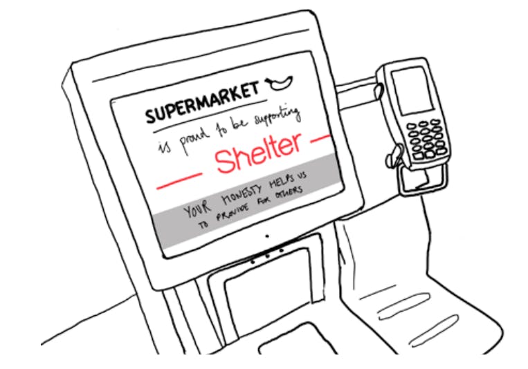
Information campaign to inform shoppers how the Retailer supports humane causes. This can also be an opportunity to educate people about the negative impacts of stealing in order to appeal to their good nature. One example might be, “Every 100 avocados we lose to theft, is £250.00 we could be donating to ‘WaterAid’. Stealing limits what we can do for our community and our planet.” Signage throughout the shopping journey could help support the campaign, making it more apparent to shoppers.
Improves Upon
Communication
- Communicates and educates shoppers about charitable partnerships.
- Improves shoppers’ perception of retailers.
Testing and Evaluation
When we talk about design as an iterative process, this means trying ideas out and amending them to get them right before they are fully developed. We need not convince you of the value of iteration, but we hope that you will advocate experimentation and plan multiple stages of testing with your staff and customers before making shop ready prototypes and implementing them.
Trying things out early and often with rough prototypes on the shop floor is part of a thorough design process. Trying things out informally serves to get early validation from those who stand to benefit from the design and thereby mitigates risk before developing formal prototypes for public testing and evaluation. Bringing in staff and members of the public to participate and voice their opinions in the testing process is both responsive and sensible.
This report cannot give the last word or a good outline on testing and evaluation without stating the obvious. It is up to you how you undertake the informal and then formal testing and evaluation stages. On this project, a full stage of prototyping, testing and evaluation was not possible given the remit of the scope and funding. Certainly, on future fully funded projects, applying what we now know from the research and insights, we could develop more concentrated design briefs (e.g. focusing on SCO layouts and signage or SCO interfaces specifically) and extensively iterate design proposals and rough prototypes. We would also build in prototype evaluation stages – for example with shop floor staff – and then use higher fidelity prototypes with the public, which can be evaluated by independent assessors as to ensure pragmatic results. Design – especially with a human-centered focus – is a life-long learning process that acknowledges that people, technology and contexts change. To a certain degree, this requires that design work takes place in situ, and that old and new designs are reviewed and experimented with periodically to be truly “fit for purpose”.
Conclusion
Whilst retailers invest heavily in upgrading stores and technology, this report suggests the key to improving the customer experience and reducing retail losses concerns a better understanding of the interactions between people, technology and the design environment – because the recognition that “context is everything” has design ramifications. Retail environments vary greatly, and factors like and store location, store size, layout, layout of SCO, location of SCO in store, time of day, technology, age of shoppers, language/cultural difference, and basket size all contribute to a diversity of problems that each store encounters differently. The design of SCO environments cannot and should not be churned out from fixed “cookbook” recipes, or reliance on machine upgrades, but instead needs to be customized, trialled and adjusted to each individual retail site.
Of course, best SCO design is not easy. And so trialling things before rolling them out is part of any design process. The problem landscape is undeniably complex and requires an amalgamation of technological and human-centred interventions and experiments. For example, investment in AI computer vision systems may help reduce some problems, and certainly video evidence of customer behaviour provides persuasive information that can contribute to staff training. But adjusting the way we respond to challenges through the lens of design thinking and design iteration is a strong option too and will help address the contextual specificity in stores needed to deliver user-friendly sustainable solutions. In an environment and industry that relies so heavily upon direct interaction with its customers, clear communication will have profound effects.
Introducing design thinking and crime prevention techniques to the SCO process is important to getting it right, whether for new store layouts or retrofit adaptation/improvement of existing sites. Given existing and future SCO contexts are always changing – new technology, different business practices, and not least, innovative and adaptive criminals – all mean that carefully pre-planning and re-planning of design responses is needed, because there are no off the shelf silver bullet design solutions that will work in the same way for every store for all time.
The approach taken in this report has been deliberately developed to respond to a diversity of shoppers and retail environments. Ultimately, it’s up to Retailers to understand that employing designers as well as machines can make a difference, and also to choose wisely how to do this and understand what aspects of user experience at machines needs to be improved, by design. Therefore, the big takeaway of this report is not just the 20 Design Concepts themselves, but rather the call to rethink your approach to designing SCO. Here is what you can do to get started:
Actions
Things to Consider Moving Forward
If you see the incorporation of human-centred design and design-led research as inherent to creating responsive and sustainable solutions to the problems faced in retail, then there are several early and pragmatic steps that can be taken to incorporate design thinking into retail practices, processes and products are:
- Conduct a survey of SCO supervisors to get opinions on what’s working, etc. An ideas box, but also use “immersion” processes to see things differently.
Store staff are the experts of the retail environment. They are the eyes and ears of the store, and their experiential knowledge of what works and what currently doesn’t is vital to any process of improvement and innovation. Part of the task is making people comfortable voicing their opinions and motivated to engage in a meaningful way, as often times insights are not apparent until you dig deep into the conversations or observations. Employing designers to immerse themselves in retail culture and feedback what they see and hear your staff saying may help you “see” things differently about what needs to be improved. Also, designers can often help shop floor staff better articulate any ideas that want to put forward, based on their experience, to make improvements to your service. - Share the report with the other stakeholders internally and propose that a joint team visits some stores, does part of a shift as a SCO supervisor and recreates the journey, personas, points of vulnerability, etc…
We encourage you to explore what might be learned by applying these design methods, tools and framework with stakeholders internally and with other known problems. You can start by using the shopper/journey framework that we provided or create your own amongst your staff that’s adapted to the systems in question. Together, you can break down processes into their fundamental steps, and pinpoint problems and challenges at these specific moments to see how the challenges arise in a network of actors (i.e people, products and services). - For future projects, consider hiring or consulting designers specialising in socially responsive design-led research and human-centered design methods.
Bringing in designers and other cross-sector knowledge holders can catalyse new conversations and insights that help define the ‘right questions’. Research centres like DAC and designers who utilise participatory methodology, can help manage this complex process and design the research and design tools that uncover and harness the knowledge contained in the retail environment. Introducing new ways of thinking about and framing challenges with a broad community of stakeholders can bring about innovation that creates both market value and social value.
Work with Designers?
The Design Against Crime Research Centre team wants to hear from you.
You can access our creative team, design thinking facilitation, and tap into our global network and diverse community of students and graduates through:
Paid Designer Internships – Support our emerging design students or graduates, those located in London as well as diverse parts of the world, to apply their skills and talent to benefit your business and develop their practice.
Graduate projects – One or more graduates are employed by us, based on your needs, guided by our expert academics who have co -produced this document to design context-specific solutions for your business.
Knowledge transfer partnerships – The UK government supports up to 67% of the costs to UK business of employing a graduate, under the mentorship of our academics, to support your business in making a transformational step-change.
Invest in training your managers to better understand and apply “design thinking” – our Social Design Institute colleagues (led by Jocelyn Bailey who regularly works with the DAC staff who authored this report) could create especially for your managerial and other staff a design thinking short course or training day to help them understand how to better apply the ideas this report has outlined. This would help support your staff on the creative journey to apply design thinking to envisage innovative solutions to better address self-checkout challenges.
Main office
ECR Community a.s.b.l
Upcoming Meetings
Join Our Mailing List
Subscribe© 2023 ECR Retails Loss. All Rights Reserved|Privacy Policy

